

Dashboards
1 Overview of Dashboards
Section titled “1 Overview of Dashboards”1.1 What is a dashboard
Section titled “1.1 What is a dashboard”A dashboard is a space where you can display different types of data in a variety of widgets such as charts, levels, dials, numbers, tables etc.
1.2 Types of dashboards
Section titled “1.2 Types of dashboards”There are different types of dashboards for different case uses. In the following section we will cover the different types and case uses it is best for.
1.2.1 Dashboard
Section titled “1.2.1 Dashboard”A standard dashboard uses a responsive grid that automatically adjusts its horizontal dimensions when the screen size changes. As the screen narrows, the spacing between components decreases while text size remains consistent. This maintains readability while adapting to different display sizes.
This is the optimal choice for rapidly deploying a dashboard page containing diverse elements like metrics, textual information, charts, and other visualizations. The standard dashboard includes both horizontal and vertical guidelines and has collision prevention activated by default, ensuring components remain properly aligned and separated.
A standard dashboard works best for:
-
Information-dense displays requiring consistent text legibility across devices
-
Dashboards viewed on various screen sizes (desktop, tablet, mobile)
-
Projects needing quick deployment without custom responsive behaviors
-
Cases where preserving relative component positioning is more important than maintaining exact spacing.
1.2.2 Scaled dashboard
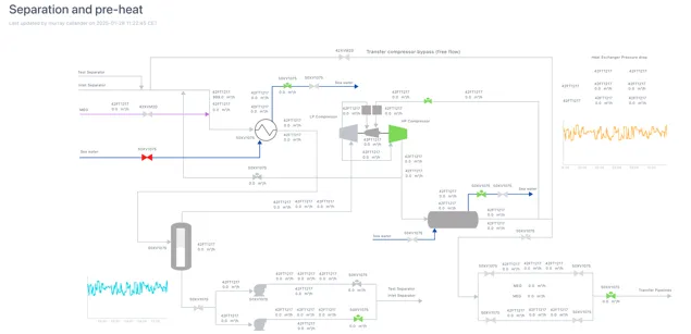
Section titled “1.2.2 Scaled dashboard”A scaled dashboard will scale both horizontal and vertical dimensions to the screen size, keeping the same aspect ratio regardless of the screen size. This type of dashboard does not have a visible grid, and it is ideal for dashboards with overlaying data on a background image or when using graphics.
Scaled dashboards are ideal when creating content that needs to be accessed in devices with different sizes or when designing dashboard with visual elements such as equipment graphics with overlayed indicator, text, levels, numbers, etc.
Below is an example of a scaled dashboard in both normal view and edit mode. When viewed in a smaller window, all the elements will stay aligned with the tanks in the dashboard.
1.2.3 Legacy dashboard
Section titled “1.2.3 Legacy dashboard”Adding a Legacy dashboard creates a page with an Eigen Plus Monitor (EPM) macro editor, enabling you to create tables and content just as you would in Ingenuity 6. The editor’s configuration will mirror that of the previous version of Ingenuity.
Note — this functionality exists primarily to enable migration of content from Ingenuity 6 and we do not recommend using it to create new content.
1.3 Where to find dashboards
Section titled “1.3 Where to find dashboards”The dashboards in your current and all workspaces can be easily located by clicking the “Dashboards” button on the left side menu.

If you click on it while in a workspace, it will show you the dashboards under that workspace, otherwise it will list the dashboards, the workspace they are in, last time they were updated and the user that created the dashboard.
1.4 Key features of dashboards
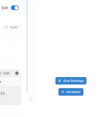
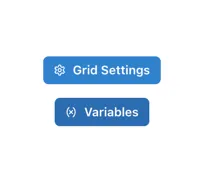
Section titled “1.4 Key features of dashboards”Dashboards have parameters that are set at a page level as well as a component level. These are the “Grid Settings” and “Variables”. (see Section 2.3 and Section 6).
You may want some of these page-level parameters to over-ride the settings a component (for example “Live mode”) and it is possible to set each component to inherit these settings.
1.4.1 Live Mode
Section titled “1.4.1 Live Mode”Live Mode means that the dashboard will regularly refresh with the latest data as long as it is open. The default refresh interval is 1 minute (60,000 milliseconds).
The page has a “Live Mode” toolbar that can be visible or hidden (see Section 2.3), and each component has a “Live Mode” section in its configuration. In the example below, the component is set to “Inherit time from grid settings”.
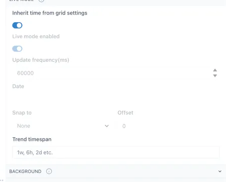
This means that the component will show the data for the time setting of the grid.
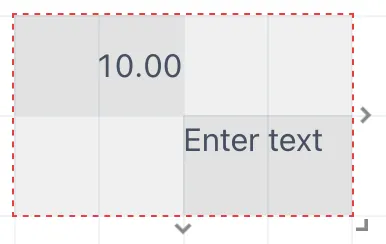
When the component is not set to inherit the time from grid settings, there are a number of options to tune the behaviour of the component to match your needs.
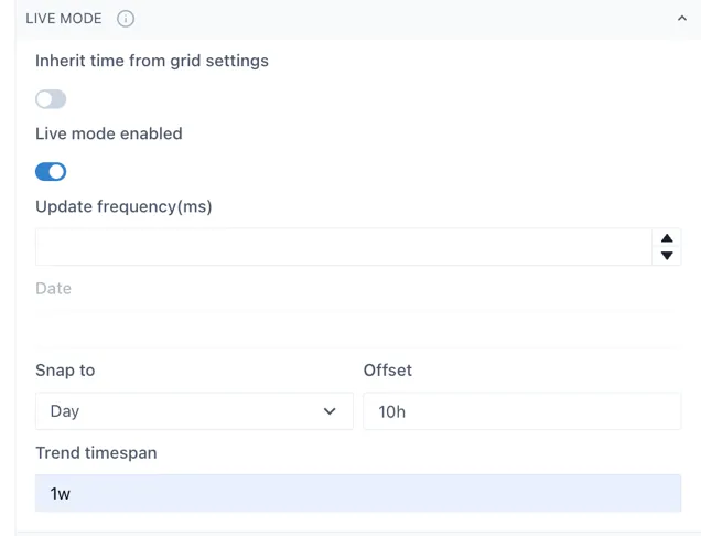
Update frequency (ms): the interval at which the component will query the data source for new information.
Date: visible when “Live mode” is not enabled. The point in time for which the component will show data
Snap to: this will force the component to show data at certain time intervals, e.g. Day, or Hour. The time will be set to the end of the most recent whole period
Offset: the offset from the end of the last whole period. In the example above, the component would always show the data for the most recent prior instance of 10:00.
Trend timespan: this determines the period of time shown in the pop-up trend when the component is clicked
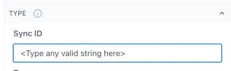
1.4.2 Component Synchronisation
Section titled “1.4.2 Component Synchronisation”Components can be linked together so that scooter bars show the same time. This applies to Charts, Sparklines and Event Tracks.
This can be useful when there are several charts/sparklines on a page, or when an Event Track is placed below a chart.
To link components, enter the same value in the “SyncID” in the “Type” configuration section for each component that you would like to link. The value can be any text string and is local to the dashboard:
2 Creating and editing dashboard
Section titled “2 Creating and editing dashboard”2.1 How to create a dashboard
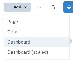
Section titled “2.1 How to create a dashboard”To create a dashboard, open the workspace you wish your dashboard to be under, click the Add button on the top right of the page and select the type of dashboard you wish to add.
2.2 Editing a dashboard
Section titled “2.2 Editing a dashboard”When you first create a dashboard, it will open in Edit mode. To put a dashboard in Edit mode at any other time, just click the “Edit” toggle in the top right corner. A configuration panel will appear on the right hand side.
2.3 Grid Configuration
Section titled “2.3 Grid Configuration”Each type of dashboard has different grid settings applied to it. To change the grid settings of any dashboard or page, click on “Grid Settings” in the right-side menu when in Edit mode. If you cannot see this option but see the configuration menu for a widget instead, click on an empty space in the dashboard or page to access it. This will open a window with four main sections, which we will cover next.

2.3.1 Settings tab
Section titled “2.3.1 Settings tab”In the Settings section, we can adjust the number of columns and the height of the rows, enable or disable the vertical and horizontal guides, the lines below the graphics, prevent collision, the scaling of the dashboard and the aspect ratio.
The vertical and horizontal guides are what makes the grid visible while on Edit mode. These are ideal to use as reference when you want to place widgets perfectly aligned. To change the size of the grid, change the number of columns and the Row height.
Disabling “Prevent collision” will allow you to overlay widgets, which is ideal for having images or graphics with data on top of it.
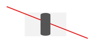
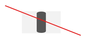
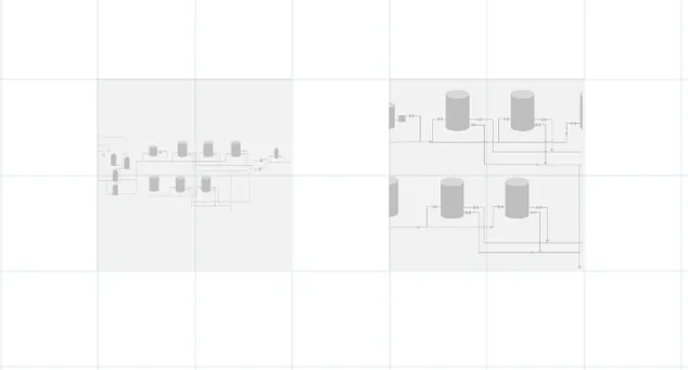
The “Show lines below graphics” will make the lines added from the Lines’ menu sit behind the graphics overlaid on them. This difference can be seen in the following image.
TIP
Enabling the scale toggle will make the dashboard scale horizontally and vertically with the screen size, as a scaled dashboard would do. A scaled dashboard will have as default settings no vertical nor horizontal guides, the prevent collision toggle off and the scale toggle on. Enabling the scale toggle is ideal when creating a dashboard that will be seen in different screen sizes, since it will keep the ratio and overall alignment of the elements regardless of the screen size used.
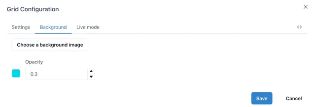
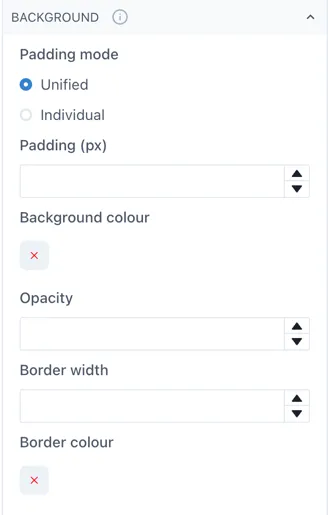
2.3.2 Background tab
Section titled “2.3.2 Background tab”In the background section you can upload a background image or set a background colour. Remember you can adjust the opacity, 0 being completely transparent and 1 being not transparent at all.
2.3.3 Live mode tab
Section titled “2.3.3 Live mode tab”The Live mode lets you activate live mode for the dashboard, allowing widgets to be set to the current time. You can also choose whether the widgets should inherit these settings or maintain their own configuration as well as changing how often the data will update.
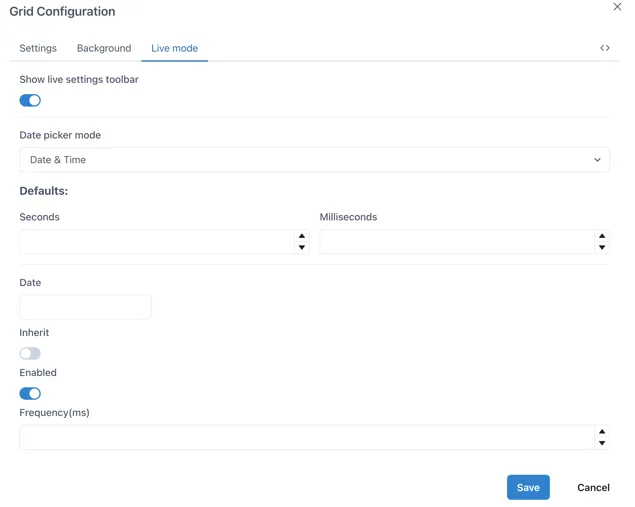
Showing the live settings toolbar will show a Live toggle on the top of the dashboard, which can be activated or deactivated and will change all the widgets in the dashboard to this time frame. When the toggle is off, you can select a specific date to set all the widgets to.
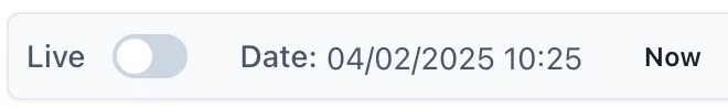
If you select a specific date in the Date section, the Live mode will be turned off and the data will not be updated, rather displayed for a fixed time frame according to your selection.
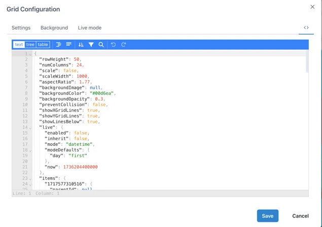
2.3.4 Editing JSON code
Section titled “2.3.4 Editing JSON code”The last section in the Grid configuration menu allows us to see the JSON code for the whole dashboard and it is signaled by the following button.

To copy the current dashboard to another page or dashboard, we can select the “text” option and copy all the code of the desired page into the code of the page where we want the copy to be in and click save. This will replicate the whole dashboard with all its widgets configured with the data sources from the original dashboard if available, yet images will have to be uploaded again in the destination page.
Each widget on the dashboard will have their individual JSON code, therefore if you wish to copy a single widget from a different dashboard into your own, you can access
their JSON code by clicking on them while on Edit mode and selecting the JSON button on the bottom of the right-side menu.
2.4 Selecting, Moving and Grouping objects
Section titled “2.4 Selecting, Moving and Grouping objects”2.4.1 Selecting individual and multiple objects
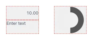
Section titled “2.4.1 Selecting individual and multiple objects”To select an object, move the mouse pointer over it and click once. To select multiple objects, either hold down the shift key while you click on each one, or click and drag the mouse pointer to draw a box over them:
2.4.2 Moving objects
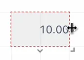
Section titled “2.4.2 Moving objects”Objects can be moved when the mouse pointer is within the boundaries of the component and the pointer has changed to a “move: icon - a 4-pointed arrow. Click on the object and hold to move it around as you would with any other drawing package.
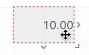
To resize an object, move the mouse pointer over one of the 3 ”>” markers on the right, bottom or bottom right and the cursor will change to a “resize” icon — a two headed arrow in the directions the component can be resized:
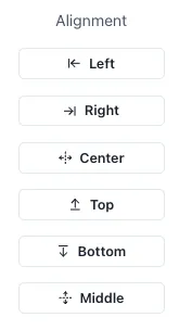
When multiple objects have been selected, the right hand panel automatically changes to the alignment tools:
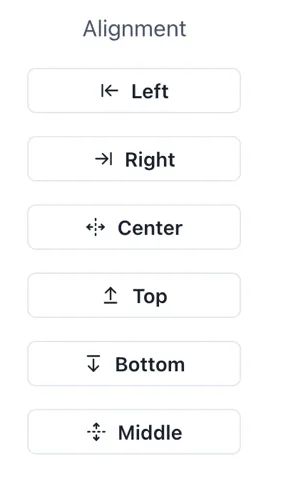
These are especially useful in a scaled dashboard where there is no grid to aid alignment.
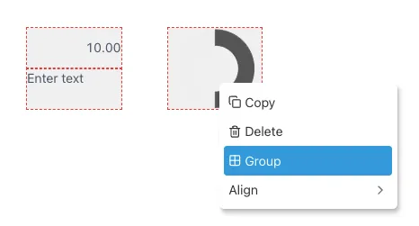
Right-clicking on a selected object brings up a shortcut menu with available options:
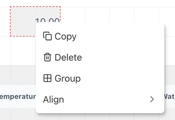
The Group and Align options only appear when more than one object is selected at the same time.
2.4.3 Grouping objects
Section titled “2.4.3 Grouping objects”Clicking the “Group” option automatically adds a Group component with the selected components in it.
Note: The Group component is always behind the individual widgets. This means that the widgets can still be selected, edited and moved about within the group, or even moved out of the group. However, if there is no area of empty space in the group, it is not possible to click on the group and move it.
3 Adding content to dashboards
Section titled “3 Adding content to dashboards”3.1 Widgets
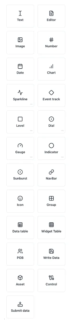
Section titled “3.1 Widgets”While on edit mode in your dashboard, you will see the Widget’s menu on the left side of the page. The widgets available are shown below.
3.1.1 Adding a widget
Section titled “3.1.1 Adding a widget”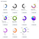
To add any widget, drag and drop its icon onto the dashboard. Clicking the three dots […] in the bottom right corner of brings up a popup of the available pre-configured templates for that component
3.1.2 Editing a widget
Section titled “3.1.2 Editing a widget”When the dashboard is in “Edit” mode, the menu on the right side will show the editing menu of the selected widget. This widget menu includes different sections you can navigate to modify the widget. A short description of each section of the widget menu can be found when hovering over the info icon on the right side of the sections.
The next sections will cover the basics on how to set up these widgets.
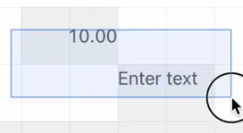
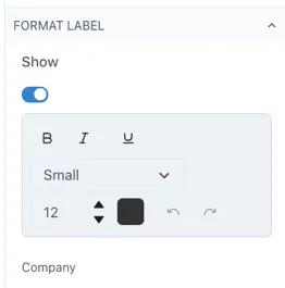
3.1.3 Text
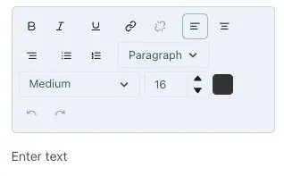
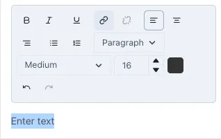
Section titled “3.1.3 Text”To add text to your dashboard, drag and drop the text widget from the widget menu into the grid. Under the “Text Editor” section you can modify the content and style of the text. Write the text in the “Enter text” space and style it as preferred.
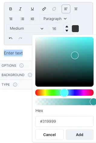
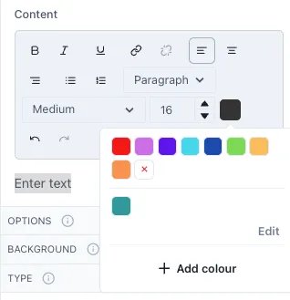
You can make the text bold, italics or underline it, change the alignment, type of text, enumerate lists and size of the text. To change the size of the text you can an option from the drop-down menu or, for a more precise size, change the size of the text by selecting it and changing the letter size. To change the color of the text, select it and then click on the color box next to the letter size. A small menu will open with some preconfigured colors. To add a different color, click on “Add color”. Where you can select from a wider range of colors and the opacity of the color. Underneath you will see the Hex code for the color you selected yet you can also input a specific Hex code in this section.
The colors you add will be saved and available for easier access in the future.
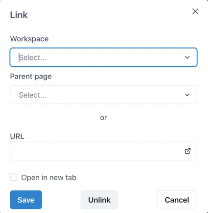
To link the text to other Ingenuity 7 pages or external URLs, select the text and click on the hyperlink button.
This will open the following window where you can select the Workspace and Page you wish to link it to within Ingenuity 7 or add a link to an external URL. If you wish to have the linked page open in a new tab, click on the checkbox “Open in a new tab”.
TIP
To add multiple text widgets with the same style in the dashboard, once you have selected the desired style for your first text widget, use the “copy” button or Ctr + C and Ctrl + V to copy it and change the content to the desired one.
3.1.4 Editor
Section titled “3.1.4 Editor”An editor widget allows you to allocate a space in the dashboard where users can edit text without switching the dashboard to edit mode. This is particularly useful for reports when you wish to add comments or notes on the values reported. When you go out of edit mode, the Editor widget will have an edit icon on the top right. Select this icon to edit the text inside the editor.

Edit your text as you would in a text widget. When done, you can select the close icon located where the edit icon was previously, this will hide the edit menu and give it the seamless appearance it had before. Inside the editor you can style your text in the desired format, enumerate lists, change the color and size of the text and link text to another Ingenuity 7 page or to an external URL.
TIP
If you want to your editor widget to stand out more in your dashboard, try changing the background color or add a border to it. You can find these options under the background section of the Editor menu on the right side of your dashboard.
3.1.5 Image
Section titled “3.1.5 Image”To add an image drag and drop the image widget into the dashboard. On the right-side menu open the Image section and then Choose and image to upload the preferred image. You will get a preview of the image where you can crop the image if the Fit is set to contain or select the area of the image that you want to focus on if the Fit is set to cover.
When you set an image with the Fit as contain, the image will always include the whole area selected in the preview, and if resized in a smaller size in the dashboard, it will scale the whole image to fit in this area. If the Fit is set to cover, it will focus on the are but will not scale the whole image to fit into the image size selected. The following image shows the difference between an image set as contain (left) and cover (right) in the same size.
3.1.6 Number
Section titled “3.1.6 Number”After dragging a number widget to the dashboard, you can open the Value section in the right-side menu to add a value to this number.
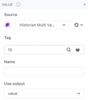
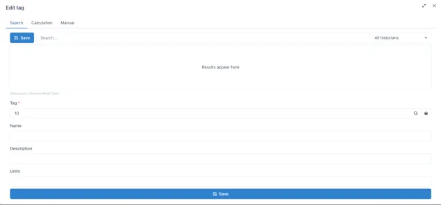
If you wish to have a fixed value, just type the number under Tag. Otherwise, you can click on the magnifying glass to open the edit tag window. If you click on the Search tab you can look up a specific tag or you can start a calculation under the Calculation tab. If you are searching for a tag and cannot find it, verify you have the correct data source under the Value section of the widget menu.
Name will be like a nickname for the tag or calculation you are using, to make it easier to identify rather than having to remember tag numbers. You can change the Name, Description and Units of each number you add.
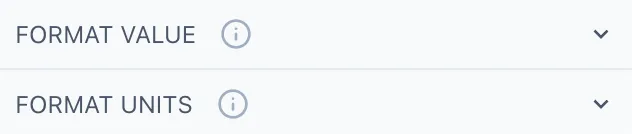
Going back to the widget menu, under the Format Value section you can adjust the style of your number as well as the decimal places shown, the alignment, thickness, size, etc. Under format units you select if you wish to display the units of the number and how to display them.
3.1.7 Date
Section titled “3.1.7 Date”The date widget will show the current date and time when you add it to the dashboard. You can change the date format under the Format section in the right-side menu. Remember that m stands for minutes and M for months.
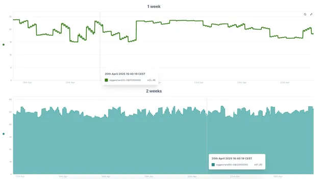
3.1.8 Chart
Section titled “3.1.8 Chart”Charts can be set to live mode by activating the toggle Live on the top left corner of the chart. This will show you the period selected until the current date, you can change this period by selecting an option from the drop-down menu or by selecting Custom from the same menu and typing the preferred period of time.

This would be for example, 2M for 2 months. Other valid entries would be:
| s: | seconds |
| m: | minutes |
| h: | hours |
| d: | days |
| w: | week |
| M: | month |
| y: | year |
If you deactivate the live mode, the date selection next to the toggle will be available to select he specific dates you want to look for, or you can still use the drop-down selection menu. Once a chart is not in live mode, it will remain in the specified period, it will not be automatically updated. While live mode is deactivated you can quickly navigate through time with the back-and-forth buttons.
On the top right of the chart, you will see the following options.
You can add a new tag by clicking on the Add tag button or by dragging and dropping a tag from your basket. Another way to add a tag would be to go on Edit mode and select the Chart widget, opening its menu on the right side of the page. Under the Datasources section you will be able to add a new tag or modify the existing ones.
By default, the charts are “unlocked”, which allows users to zoom in by selecting a specific part of the chart and change the axis by scrolling while hovering over the axis. To revert the chart to its original position before zooming in, click on the undo button that will appear to the left of the Add tag button.
If you wish to keep the chart “locked in” or fixed, you can click on the lock button to set it fix. This is very useful when having dashboards and reports with multiple charts in them where you must scroll down to look at all the content.
In the cog wheel you will find some settings options such as the legend display, edit axis and title, and download options. The share button will open the chart in a new page, where you can save it or copy the URL to share it with more users.
The magnifying glass opens the chart in a pop-up window, allowing you to look at it in more detail, the changes done on the pop-up chart will not affect the original component. This option is ideal when you wish to look more into detail in a specific chart on a dashboard that contains several charts or widgets in it.
The last button with the arrows allows you to set the chart in seamless mode, hiding the top menu. To go out of seamless mode you click on the same button.
To edit the axis of the chart, you can click on the cog wheel in the top menu and select Edit Axes or directly select the cog wheel next to the axis.
In the legend you will be able to see all the tags and calculations on the chart and edit how they are displayed on it. It is recommended to add a name to each tag or calculation to identify them easily while on a chart.
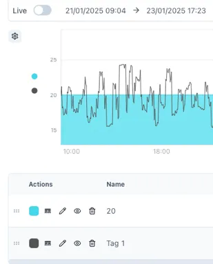
The 6-dot selector allows you to change the order of the tags included in the chart, the values added last will be displayed on top of the previous ones. Rearranging this order is important when you have a chart with lines, areas, bars, etc. To bring front a specific tag, move it to the bottom of the legend. See the next image as reference.
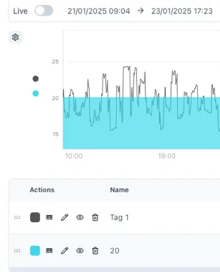
The rounded square button allows you to change the color of your tag or calculation. In the button with lines and dotted lines you can change the line of our tag from solid to dashed, dotted, etc. and change the line weight and point radius of it. The pencil button opens the tag or calculation, name, units and description. The eye button hides and unhides tags from the chart temporarily and the bin button deletes the tag from the chart.
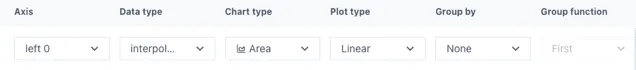
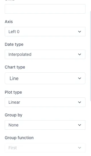
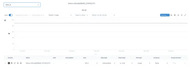
Next we have the units and description of the tags in the chart as well as the axis in which they are shown, data type (auto, interpolated, raw), chart type (line, area, stacked area, bar, stacked bar, points and lines and points), plot type (linear, step, step before, step after, best fit), grouping (none, by hour, day, month, etc.) and group function if the data is grouped by.
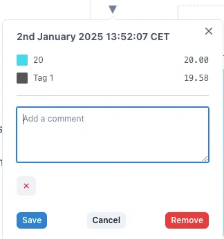
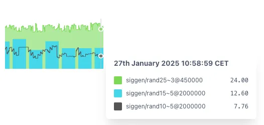
To add markers to your chart, hover over the point you want to mark and click the space bar. This will add a subtle vertical marker in this position. To add a comment to this marker, you can click on the little triangle above the marker.
Further information on the Chart widget and its configuration can be found in the Charts Product Manual.
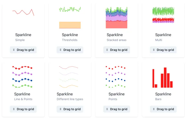
3.1.9 Sparkline
Section titled “3.1.9 Sparkline”Sparklines are full Charts in disguise, therefore, they can be modified in the same manner as a Chart. You can explore different examples of sparklines by clicking the three-dot button in the sparkline option.
To add any of these templates to your dashboard just drag them into the grid and you can start editing them.
You can add the value under the Datasources section of the menu, clicking on the magnifying glass to add to search for tags or making calculations, making sure you have the correct source from the drop-down menu before.
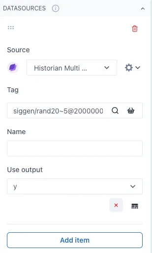
By clicking the Add item button below, you can keep on adding several values to the Sparkline as desired and the cog wheel next to the sources drop-down menu will open more options to modify the data shown such as the data type, chart type, plot type and if any grouping on the data.
Same as in a chart, you can overlay several values with different chart types to create more complex displays. When out of edit mode, you can see the values within the sparkline by hovering over it.
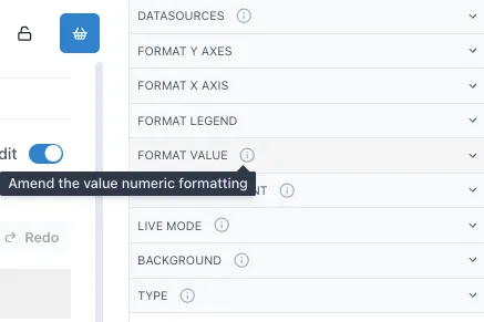
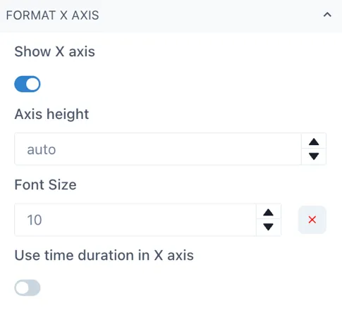
To modify the axes height, you can select the Format Y Axes or Format X Axis depending on the axis you wish to change. For the X axis, simply open the Format X Axis section and change the Axis height, it is by default on auto, but you can change it by clicking on the arrow button or by typing the number. Be sure to have the Show X axis toggle activated to see the changes you are implementing.
TIP
It is recommended to use the arrows to change the axis height size slightly and have a better control. Start by going up and finding the correct height, if you wish to reverse to the auto setting, simply delete the number and it will default to auto height.
To change the Y axes, open the Format Y Axes section in the menu, you will see in bold the Y Axes you have in your sparkline or chart at the moment.
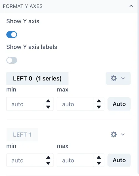
There are 4 left Axes and 3 right Axes in which you can chart your trends. Click on the cog wheel next to the axis you wish to change and then scroll down to the axis area width to modify the space between the widget edge and the axis.
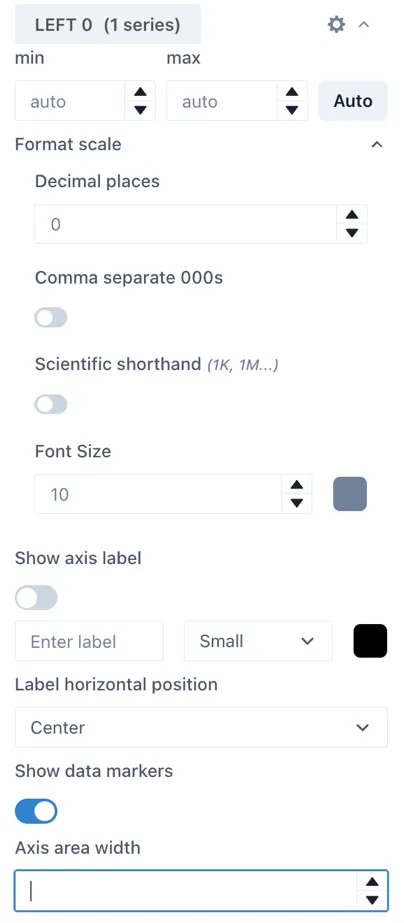
By default, the sparklines have a wide area between the edge of the widget and the beginning of the Y axis to accommodate for situations where you have several Y axes. Next, we have an example of a default sparkline and a sparkline with an area width of 24 for comparison while on edit mode. This translates to a sparkline or chart that occupies more of its widget space.
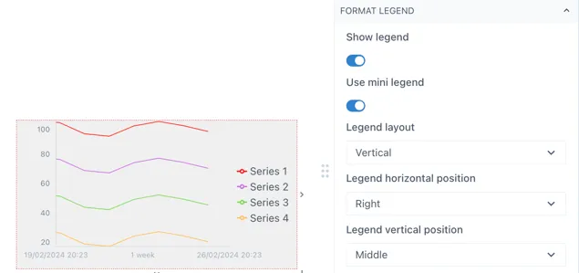
You can add or modify the format of a sparkline in the Format Legend section of the menu. In this section you can toggle the Show legend to activate it and the Use mini legend toggle to select between the mini legend or the more extensive legend. While working on a sparkline, it is recommended to use the mini legend to use the space more efficiently.
TIP
The legend (mini or not) will display the Name of the series in the sparkline or chart when available, otherwise it will display the tag name or the calculation. Remember to give your tags and calculations a Name to identify them easily in a sparkline or chart’s legend.
You can edit other aspects of the legend under the same section of the menu such as the legend vertical and horizontal position, the legend width, font size and if you want to wrap the levels. Next is an example of how you can modify mini legend for a sparkline.
3.1.10 Level
Section titled “3.1.10 Level”Levels can have one or multiple values within the same widget. You can see some level templates or examples in the three-dot button in the Level section of the Widget menu.
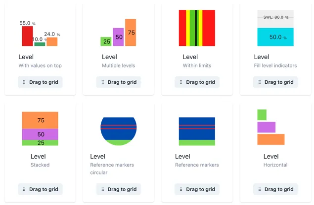
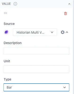
Under the Value section of the widget menu, you can select the tags or calculation you want to display in a level as well as adjust its color. In the cog wheel next to the source, you can see more options to modify this item. Under Type, you can select if you want to display it as a bar or a line in the level. The line option is ideal for displaying a threshold value of reference for the tag you are evaluating.
Under the Min/Max values section of the menu, you can adjust these values by changing the fixed value or using a tag or calculation for the minimum and maximum of the level.
You can display or hide the values of the level in the Format value section. If you add multiple items in the same level as bars, they will be initially set as stacked bars. If you wish to change this, go to Format bars and change the Stacked bars toggle.
3.1.11 Dial
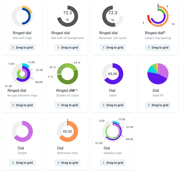
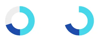
Section titled “3.1.11 Dial”Dials can have one or multiple values in the same widget. Explore some of the dial templates in the widget menu, you will find an ample selection of options with one or multiple rings.
Tags and calculations can be added in the Value section of the widget menu, and you can keep adding items as desired. Initially, values are set as slices of the dial, but you can change them as lines by clicking the cog wheel next to the source and changing the Type to Line.
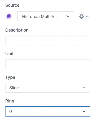
You can have multiple rings on the same dial, to change an item to another ring, change the Ring number in the same cog wheel button.
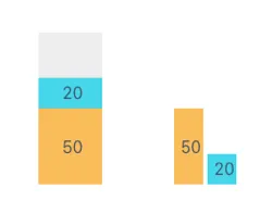
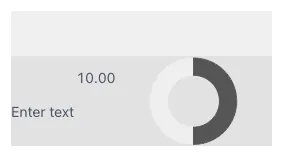
Change the minimum and maximum values in the Min/Max Values section and display or hide the values in the Format Value section. Under this section you can also decide if you want to show the background of the dial, meaning the “empty” space between the value and the maximum value. Here is an example of a dial showing and hiding this background.
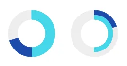
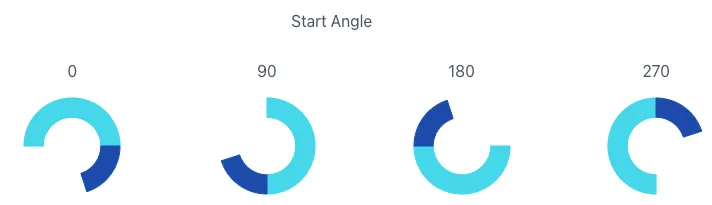
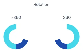
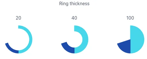
Under the Format rings section, you can modify the start angle of the rings, dial size and rotation direction, ring thickness and the gap between rings. Here are some examples of how these values change the dials.
3.1.12 Gauge
Section titled “3.1.12 Gauge”In gauges, the main value you add will be identified by the needle and the value at the bottom. Several templates of gauges can be found in the widget menu in the three-dot button in the Gauge widget.
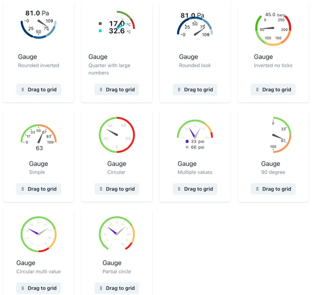
You can change the minimum and maximum values of the gauge as well as adding different threshold values as reference.
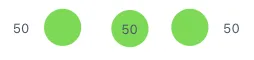
The threshold values act like a dial or level with several stacked values, and it is recommended for better visual display that the sum of the thresholds is equivalent to the maximum gauge value. Here is an example of a gauge with 3 threshold values of. 33.33 each and a maximum of 100.
Remember that the thresholds act like a stacked bar or value, therefore, you might need to make small adjustments or calculations to display the thresholds correctly.
You can change the ring format in the same way as with a dial and style the ticks within the gauge to optimize the widget to your needs.
3.1.13 Indicator
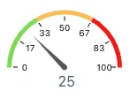
Section titled “3.1.13 Indicator”Indicators allow you to compare a tag or calculation with one or several criteria and define a status based on that. You can add a value and their criteria In the Value section of the widget menu. Both the value and the criteria can be a manual value, tag or calculation.
Indicator — Static Criteria
Section titled “Indicator — Static Criteria”Static criteria are fixed numbers to compare the value to. For example, ”> 5” means greater than 5. To add static criteria, select the Add static criteria and fill out for the manual criteria.
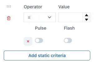
Indicator — Data source Criteria
Section titled “Indicator — Data source Criteria”Data source criteria are dynamically queried from other data sources. To use a tag or calculation (or other data source) instead of a fixed manual criteria, select the Add data source criteria button.
TIP
You can add as many criteria as you need, even if it is a combination of static and data source criteria.
Under the Graphic section of the menu, you will find more indicator shapes such as triangle, square, etc. and more categories of indicators with different shapes within them.
When working with graphics, it is useful to display the value that you set to the indicator. You can do this by activating the Show value toggle in the Format Value section of the menu. You can define the position of the value to the left, center or right of the graphic indicator.
TIP
Remember to verify the value and units are in a visible color for all the colors you include in your indicator criteria. You can change this color in the same Format value or Format units’ section of the menu. If you leave the predefined color, this will adjust itself between light and dark mode, other colors will remain the same for both themes.
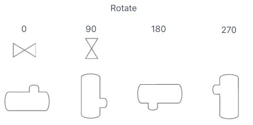
To rotate graphic indicators, you can open the Format indicator section and change the value under Rotation. Use the up and down buttons to change the rotation slightly or type in the degrees you would like the indicator to rotate. Next you have an example of the rotation of an indicator.
3.1.14 NavBar
Section titled “3.1.14 NavBar”The NavBar widget allows you to create a Navigation bar or button that links to another page within Ingenuity 7 or an external URL. Select the workspace and the parent page you wish to link it to and add a label, which will be the text to click on to navigate to that page.
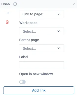
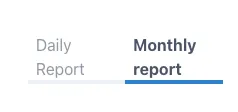
If you wish to link to an external URL, change “Link to page:” to “Link to URL” and fill out the information needed. Here is an example of what a NavBar looks like out of Edit mode and linking to 2 spaces. The highlighted option means you are currently on the page that option is linked to.
The initial layout will be horizontal, but you can rearrange this widget to have a vertical layout by changing the size of the widget in the dashboard.
When linked to another dashboards or pages within Ingenuity 7, it will redirect to that dashboard even if the dashboard changes name or if it is moved to another workspace.
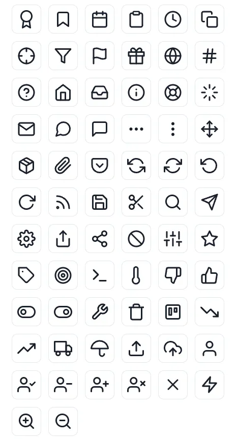
3.1.15 Icon
Section titled “3.1.15 Icon”You can add a variety of icons to your dashboards to further improve their appearance. The icon widget contains several categories of icons such as alerts, arrows, charts, media, notifications, etc. Below is an example of the icons that can be found in this widget.
3.1.16 Group
Section titled “3.1.16 Group”The group widget allows you to group several widgets by putting them inside the group widget. Once they are inside the group widget, you can move the group widget in the dashboard and relocate all the widgets inside it easily. This is ideal when you have several text, numbers and indicators widgets you wish to move or copy, since you can copy a group widget with all the widgets inside it rather than doing so individually. This works for all the widgets, graphics and lines inside the group widget.
3.1.17 Data Table
Section titled “3.1.17 Data Table”Data tables are ideal for displaying different data or parameters from one single data source. Next is an example of what a data table looks like out of edit mode.
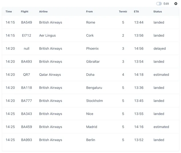
To set up a data table first you select your data source in the Source section of the widget menu, depending on the source you select you might have to type more information such as an airport code if you are displaying flight data.
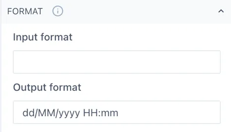
Next you should go to the Columns section in the menu and select Add column. The name will be the column name, and you can select the primary output option of this column. Under Type is important to match the type of data you wish to display from this column, for example Date or Text. If you are selecting Date, remember you can set the date format under the Format section under the date column.
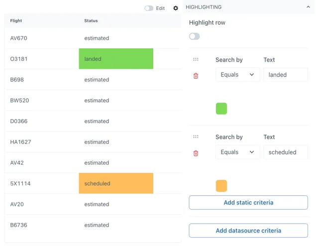
You can add highlights to your table when the value in a row from that table matches your criteria. Criteria can be static or based on a data source, and it is case sensitive when working with text values.
3.1.18 Widget Table
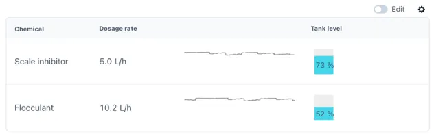
Section titled “3.1.18 Widget Table”Widget tables are designed for the case where you need a repeating pattern of components for sets of identical equipment or datasets. For example, if you have a hotel with an airconditioning unit in each room measuring temperature, pressure, humidity and CO2. Each row can be a different room.
Widget tables can include different types of widgets in them, and they provide the possibility of linking each widget to their own distinct data source. This is ideal for joining data from multiple sources in a single table for easier comparison between them. The following is an example of what a widget table can look like, this will very according to the widgets you wish to use in your widget table.
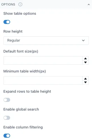
To modify a widget table, adjust the table settings such as row height, minimum table width, etc. under the Options section of the widget menu.
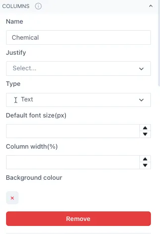
Next, set the number of columns and what type of data each will have under the Column section. The data type can change between columns but should remain the same within the rows of the same column. It is recommended to add names to each column but leaving the Name blank is also an option.
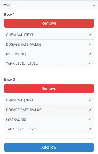
Once you have set up the columns, open the Rows section and start adding the Row 1 of your columns. Under each Row you should see all the column categories you set before.
In this example we have 4 columns, each with different type of data and one of them without a name for the column. This set up would give the following table as result.
You can adjust the column width per column under the Column section of the menu, this will allow you to optimize the fit of the widgets in your table. Simply type a number between 0 and 1, taking into consideration that the sum of the columns should give 1 as total.
4 Live Graphics
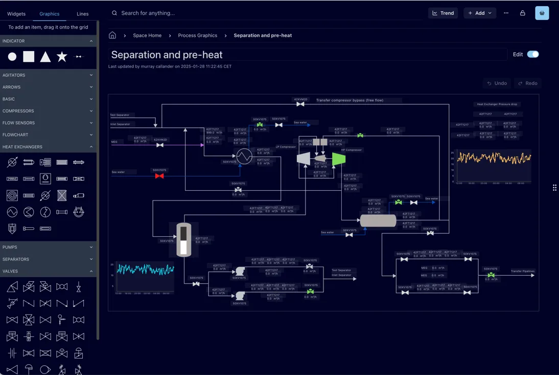
Section titled “4 Live Graphics”Ingenuity 7 includes a powerful new module to enable the creation of detailed graphics such as control system mimics, live process flow diagrams, network overviews, equipment dashboards etc. In addition to adding all the widgets for a dashboard, it is now possible to access graphics from stencil libraries, add data and animations and connect them together with lines.
Unlike traditional graphics packages, Eigen Ingenuity 7 users can combine data from multiple different sources in one graphic.
4.1 Creating Graphics
Section titled “4.1 Creating Graphics”Graphics are Dashboards so the starting point is the same — create a Dashboard or a Dashboard (Scaled). Graphics can be used in both types of dashboards, but it is recommended to use the Dashboard (Scaled) to have more freedom of positioning your graphic indicators and have the dashboard scale itself to the window size.
To open the graphics menu in Ingenuity 7, open a dashboard or page in edit mode and select the Graphics option in the left side menu.
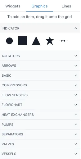
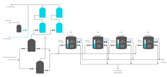
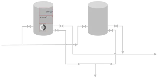
Under each section of the menu, you will find a varied selection of items you can drag of the grid to start mapping your system. These graphics work as an indicator from the widget menu so you can link them to a fixed value, tag or calculation and add static or data source criteria to denote their state. You can find more information on indicators in 3.1.11 of this manual. You can add and overlay widget items on the grid to further complement your system map as the image below, remember deactivating the toggle for Prevent collision under the Grid settings.
To make it easier to replicate complex elements such as the previously shown., it is recommended to add the items into a group widget and the copy this widget or selecting all the items to copy while on Edit mode and use Ctrl + C. To connect the different graphics, open the Lines menu on the left side. This will open different options of lines to add to your system.
4.2 Lines
Section titled “4.2 Lines”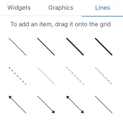
Drag and drop the lines from this menu or draw the line with your cursor in the grid, if you hold Shift you can create corners in your lines as the image below
. 
You can also change the type of line once you have in the grid by selecting the line you wish to change and click on the option in the left side menu you wish to change to. You can change the color and further modify your lines on the right-side menu
4.3 Understanding Layers and Object Orders
Section titled “4.3 Understanding Layers and Object Orders”It is important to understand that there are 3 layers in any dashboard:
-
Top
-
Middle
-
Bottom
The top layer is composed by the widgets and graphics of the dashboard. The middle layer includes the lines, and the bottom layer is the background of the dashboard. It is possible to select objects from the top and middle layers simultaneously in edit mode as shown below. When they are selected you can move, copy or delete them all simultaneously, similar as if they were in a group widget.
However, objects in the bottom layer are not available for selection, for example, images set as background in the grid settings. They will remain in the background in their fixed position, and you would only select the widgets, graphics or lines that are on top of them. In this example, the image is set as background in the grid settings, therefore when we select and drag the mouse to “select” the tank on the left area, we will only be selecting the widgets, lines and graphs on top of it, not the tank itself.
When we are overlaying different elements in a dashboard, the smaller objects will always be on top of the larger objects so they can be seen and selected. For example, if I add a filled graphic of a tank and drag it towards a number widget that is smaller than the tank itself, the number will remain on top once you click anywhere on the dashboard. This works regardless of the order in which you added the elements.
5 Model Driven Dashboards
Section titled “5 Model Driven Dashboards”Model Driven Dashboards take their configuration from objects (Assets) in the Knowledge Graph. This allows you to make a single dashboard that covers multiple objects of the same type, for example Wells, equipment, rooms in a building etc. An object control is added to the page and this acts as a data source for other components on the page.
5.1 Adding a model driven control
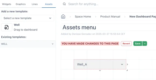
Section titled “5.1 Adding a model driven control”To add a model driven data source to a page, select the “Assets” tab in the component panel on the left.
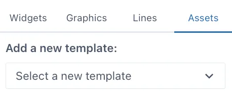
Select an object template from the drop-down menu — the dropdown lists all the available object types in the Knowledge Graph. If the list is very long you can start typing the first few characters of the object type you are looking for.
When a valid object has been selected, an icon appears below the dropdown. Drag this icon to the dashboard layout. This will create a drop-down control with a list of all the objects of that type in the Knowledge Graph. Resize it if necessary and place in the preferred location on the dashboard.
5.2 Using attributes from objects as component values
Section titled “5.2 Using attributes from objects as component values”5.2.1 Dragging a component directly
Section titled “5.2.1 Dragging a component directly”Under “Existing templates:”, open the template you added previously. This will open the related tags to this template in the asset. For example, the example Well has a tag for annulus pressure, bhp, bht, etc.
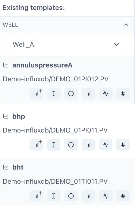
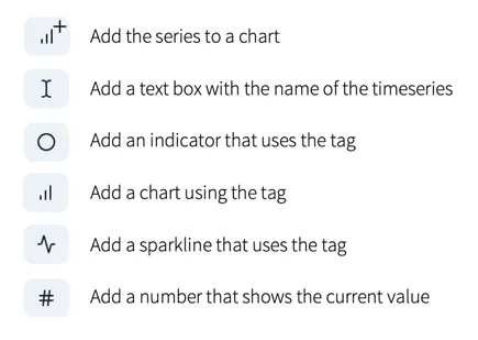
Under each tag you will find different button for the common components used with tags.
To add them in your dashboard, drag and drop them into the dashboard or to the chart in the dashboard.
When you have added some of these widgets into the menu, save your changes and change the selector you initially dragged into the page. The widgets added from the Assets menu will change to display the respective tag for the item you have selected.
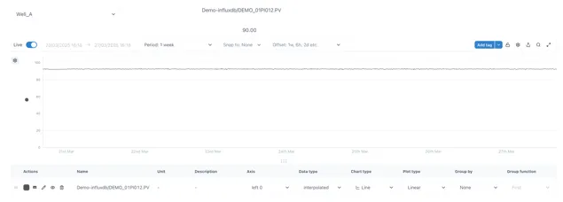
In this example, when selecting “Well_A”, the annulus pressure of this well will be displayed in the chart along with the numeric value and the name of the tag. When changing the selector to “Well_B” while on non-edit mode, all these widgets will change to display the same information but from Well B.
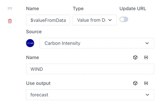
5.2.2 Using the Asset datasource in the component configuration
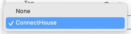
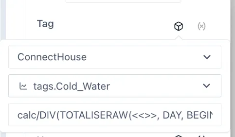
Section titled “5.2.2 Using the Asset datasource in the component configuration”Any component can be configured to use the Asset Control data source
using the “Assets” icon  above the Tag field. When you click the
Assets cube it will show a list of the available Asset data sources on
the page.
above the Tag field. When you click the
Assets cube it will show a list of the available Asset data sources on
the page.
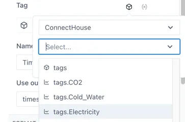
When one is selected, the property or associated timeseries parameter can be chosen from the dropdown underneath.
5.2.3 Using an attribute in a calculation
Section titled “5.2.3 Using an attribute in a calculation”Related timeseries tags on numbers from an object can be used in a calculation by completing the “Use in string” option and entering ”<<>>” in place of the tagname
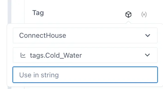
For example, in this case, to convert the 6 minute pulse count on the cold water to liters and totalize the value over the day, you would use the formula:
calc/DIV(TOTALISERAW(<<>>, DAY, BEGIN_DAY, 6m),11)
TIP
It is not possible to use the Calculation Builder from the “Use in string” option so it is best to make the calculation separately first and copy it, then replace the tag with ”<<>>“.
5.3 Advanced options
Section titled “5.3 Advanced options”5.3.1 Updating the URL
Section titled “5.3.1 Updating the URL”By storing the state of the Asset Controls in the URL, it is possible to make links to a certain state of the dashboard. For example, if you want to make a link from a drawing of “Well B” to the model driven dashboard with ‘Well_B” already selected, or if you would like to create a bookmark of the page with a certain object selected.
To update the URL with the currently selected state of the Asset Controls on the page, toggle the “Update URL” switch under the Asset Options section of the configuration:
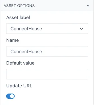
Note: if there is more than one Asset Control on the page, this must be done for each Asset Control that you would like to update the URL.
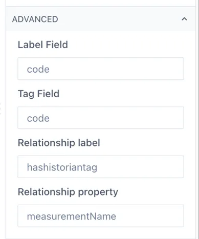
5.3.2 Using other properties and relationships in the Knowledge Graph
Section titled “5.3.2 Using other properties and relationships in the Knowledge Graph”By default, the Asset Control object will look for the standard properties and relationship parameters in the Eigen Knowledge graph. If you would like to use different properties, or relationship parameters, this can be configured under the Advanced section. For example, when the Knowledge Graph being used is not and Eigen one.
6 Variables
Section titled “6 Variables”Variables are page (dashboard) wide parameters that allow you to pass information between components and create dynamic dashboards that update based on user input and selections.
6.1 Setting up variables
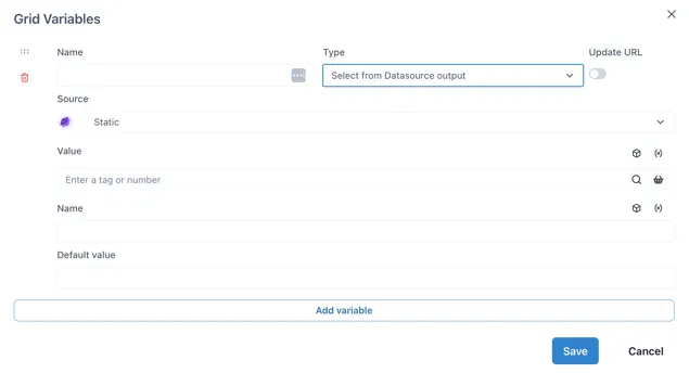
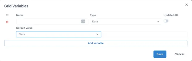
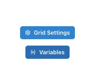
Section titled “6.1 Setting up variables”Variables are set up at the page level by clicking on the “(x) Variables” button in the right hand pane, which is visible when the grid is selected (by clicking on any empty area in the grid).
This will bring up the Grid Variables form:
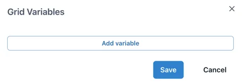
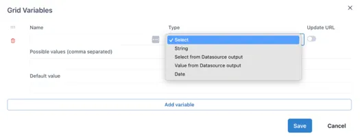
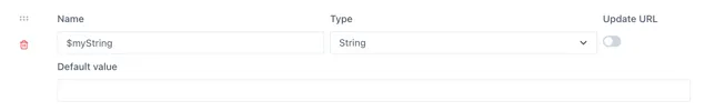
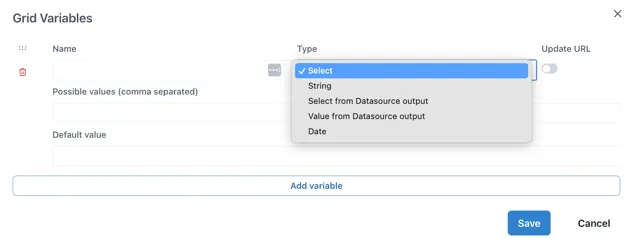
Clicking “Add variable” adds an empty variable configuration. The Name and Type fields are always present and the fields thereafter depend on the selection made in the Type field:
Name: Text input for the name of the variable. Must start with a dollar sign ($) and contain only letters and numbers. No spaces or special characters.
Type: dropdown to select where the value of the variable comes from. It has the following options:
Select: type a comma separated list of possible values directly in the variable configuration.
String: a text string entered into the variable configuration.
Select from Datasource output: The list of possible values comes from an Ingenuity data source.
Value from Datasource output: A boolean indicating if multiple values can be selected for this input.
Date: A boolean indicating if multiple values can be selected for this input.
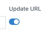
Update URL: Enable this to update the URL with the selected value of the variable to create a link to the state of the page that can be shared.
6.1.1 Select Type variables
Section titled “6.1.1 Select Type variables”The Select type variable lets a user select from a pre-defined list of options. These are typed as a comma-separated list in the “Possible values” field. For example,
Aa, Bb, Cc
To show a more user friendly name to the user, labels can be defined in square brackets before each variable:
[Label 1]Aa,[Label 2]Bb
For example, a list of possible airports with their codes would be defined as:
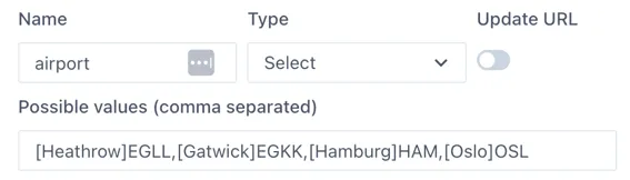
The user will see:
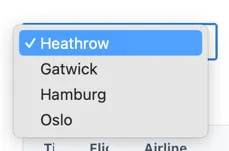
Use “Default value” field to define the value that will be selected the first time the page loads (and if there is no value passed in the URL).
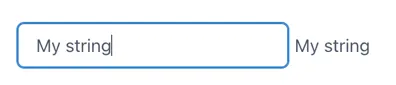
6.1.2 String Type
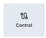
Section titled “6.1.2 String Type”The String type variable takes text input from a “Control” component and stores in in a page variable.
This is useful where the user is required to input text that is passed to an external data source, that cannot be pre-defined.
The example below uses a Control component to enter the data into the $myString variable and display it in a Text component
6.1.3 Select from Datasource Output Type
Section titled “6.1.3 Select from Datasource Output Type”This variable type takes the list of possible values from any of the installed data sources in Ingenuity. Much like the configuration of a component on a dashboard, the data source is selected from a dropdown list and the fields underneath will update to reflect the inputs and outputs from that data source.
Where the data source requires an input, this can come from other page variables (by clicking the (X) icon) or the Knowledge Graph (cube icon).
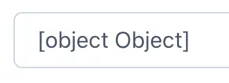
Variable name must be prefixed with ”$”
Section titled “Variable name must be prefixed with ”$””The “Select from Datasource Output” type variable is an advanced variable that can contain a data object rather than a single value or string. Because of this, the variable name must be prefixed with a dollar sign ($). For example, “$foo”. If the variable name does not start with ”$”, the Control component connected to it will show
6.1.4 Value from Datasource output Type
Section titled “6.1.4 Value from Datasource output Type”The “Value from Datasource” type returns a single value for use in a component such as a Number, Level, Dial, Gauge etc. It is not used with a Control component.
The use case for this variable is to pass values to other variables.
6.1.5 Date Type
Section titled “6.1.5 Date Type”Date type variables store a timestamp.
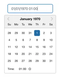
When connected to a Control component, users can select the data and time from a date picker:
Default value
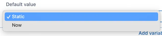
Section titled “Default value”The default value has two options: “Static” and “Now”
If “Static” is selected and the value field left blank, the date picker will start at 1^st^ Jan 1970, which is most probably annoying for users. Clicking in the field to the right of the dropdown will show a date picker and it is a good idea to set a date (and time).
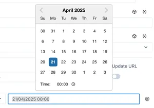
Selecting “Now” will show additional configuration options:

Offset: -1d for yesterday,
Default minute: [0 — 60] Set to 0 for the start of the nearest hour
Default hour: [0 — 24] Set to zero for midnight, 8 for 08:00 etc.
Default day: [1^st^- 31^st^, Last] Select the day of the month
For example, to default to midnight on the 1^st^ of the month:

6.2 Using variables
Section titled “6.2 Using variables”Variable values are set by Control components or the value of other variables on the page.
6.2.1 The Control Component
Section titled “6.2.1 The Control Component”The Control component will automatically adapt it’s display type to the variable type connected to it. For example, if a “Select” type is connected, the control will display a dropdown box. If a “String” type is connected, it will display a text input box.
6.3 Worked Example — Flight information
Section titled “6.3 Worked Example — Flight information”The example below is from our demo site:
https://ingenuity.eigen.co/pages/view/flights
Users can select an airport and see the live list of Arrivals and Departures
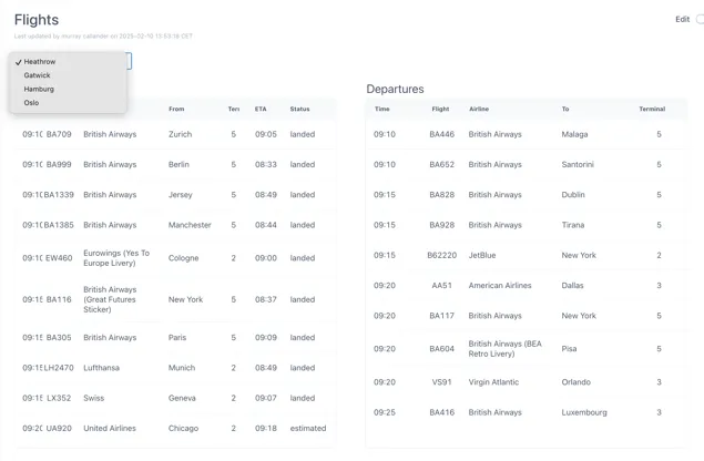
An “airport” variable is used to pass the selected airport to the FlightRadar24 data source.
6.3.1 Configuring the data source
Section titled “6.3.1 Configuring the data source”Make sure the FlightRadar24 data source is installed and click the “Details” button:
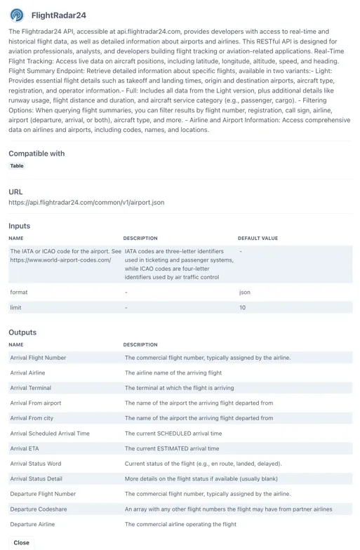
Scroll to the Preview section at the bottom.
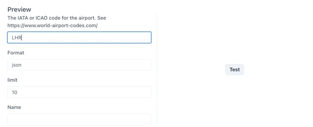
Enter an airport code (e.g. LHR for London Heathrow) and click Test.
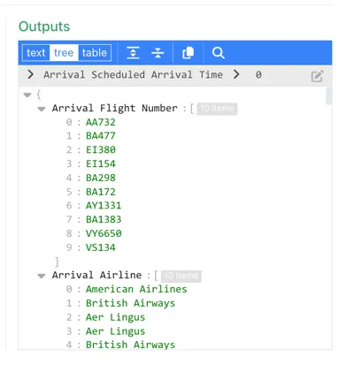
Check through the Outputs to verify that the data source is working.
6.3.2 Configure the “airport” variable
Section titled “6.3.2 Configure the “airport” variable”In Edit mode in your blank dashboard, click anywhere on the grid and then click the “Variables” button from the right-hand panel:
Click “Add variable”
Leave the Type as “Select” (this is the default)
Configure the variable as follows:
The complete list of airport codes can be found here: https://www.world-airport-codes.com/
6.3.3 Add the select box to the page
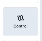
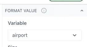
Section titled “6.3.3 Add the select box to the page”Add a “Control” component to the page:
Configure the control to use the “airport” variable under the “Format Value” section.
6.3.4 Configure a table to use the variables
Section titled “6.3.4 Configure a table to use the variables”Add two “Data table” components to the page; one for the Arrivals and one for the Departures.
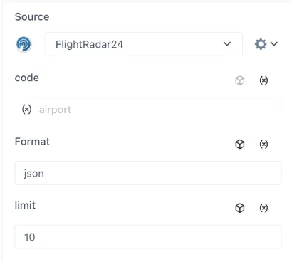
In the Source section of each table, select the FlightRadar24 data source. The input for the “code” will appear. Click the “(x)” icon on the right to connect this input to a page variable and select the airport” variable.
The table Source section should now look like this:
Add the following columns in the tables for the associated outputs from the FlightRadar24 data source [Type in square brackets]:
Arrivals Table
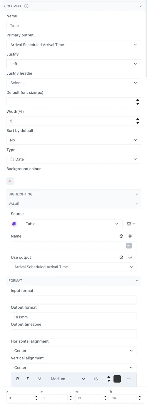
Section titled “Arrivals Table”Time [Date]: Arrival Scheduled Arrival Time
Flight [Text]: Arrival Flight Number
Airline [Text]: Arrival Airline
From [Text]: Arrival From City
Terminal [Text]: Arrival Terminal
ETA [Text]: Arrival ETA
Status [Text]: Arrival Status Word
Departures Table
Section titled “Departures Table”Time [Date]: Departure Scheduled Arrival Time
Flight [Text]: Departure Flight Number
Airline [Text]: Departure Airline
To [Text]: Departure Destination Name
Terminal [Text]: Departure Terminal
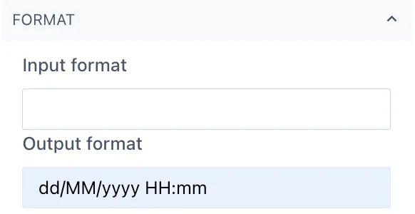
Configuring the Time column
Section titled “Configuring the Time column”To display the time correctly, the Time column in both tables should be set to be a [Date] type. Then under the “Value” section the Source should be set to “Table” and “Use output” = the same as the column field (e.g. Arrival Scheduled Arrival Time)
Under the “Format” section the “Output” format should be “HH:mm”.
See the highlighted sections below:
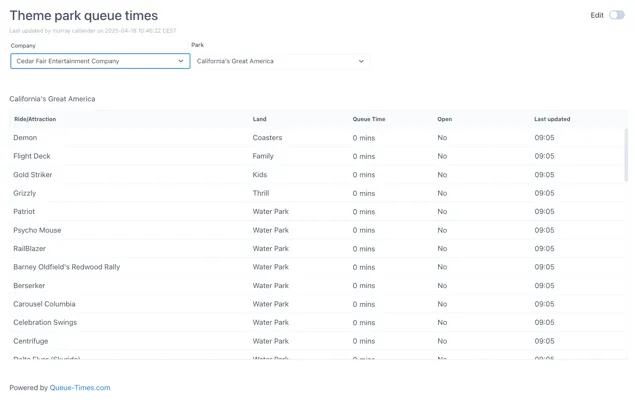
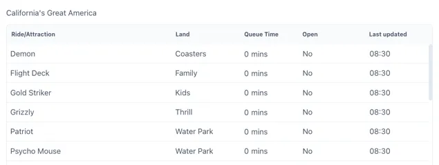
6.4 Worked Example — Theme Park Queue times
Section titled “6.4 Worked Example — Theme Park Queue times”The example below is from our demo site:
https://ingenuity.eigen.co/pages/view/theme-park-queue-times
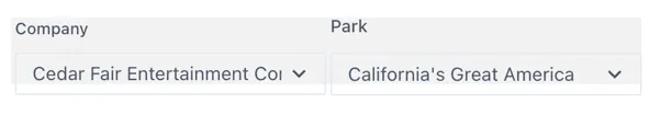
This page has two dropdown boxes where users can select the company and the park and see a list of the current queue times for all the rides.
Two variables are set up which reflect the name of the data returned from the source:
-
$company — the id of the company
-
$park — the id of the park
To follow this example, create a new Dashboard page in your own space.
6.4.1 Configuring the data source
Section titled “6.4.1 Configuring the data source”This page uses the Theme Parks and Theme Park Queue Times data sources, which are configured against a publicly available APIs to return the list of theme park companies, the theme parks for that company and finally the queue times for the rides in that theme park.
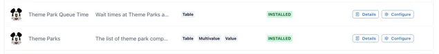
Make sure these data sources are installed and then click the “Details” button against the Theme Parks data source:
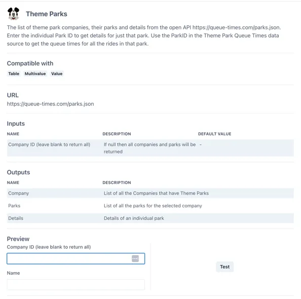
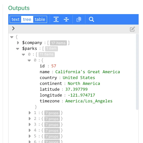
Under the “Outputs” section we can see that the data source returns three outputs “Company”, “Parks” and “Details”.
Click the “Test” button to see the data that is returned:
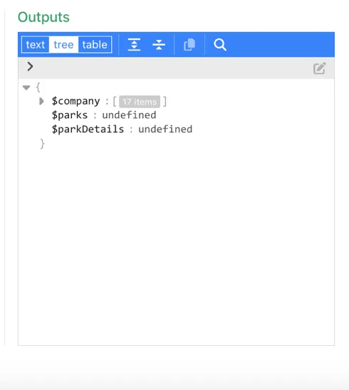
Only the $company output is populated. If we expand it we can see there is a list of companies under the path $company.n (where n is a number from 0 to n) and each company has two properties; name and id
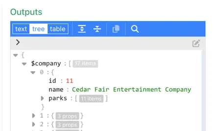
Take the id of the first company; 11 and enter it in the “Company ID” field
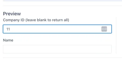
and re-test the output:
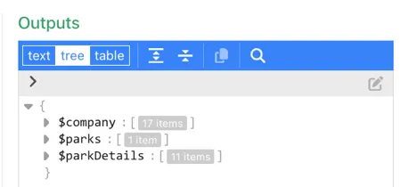
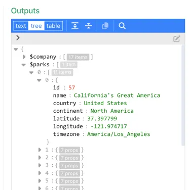
Now all three outputs have valid data. If we expand the $parks output, we can see that it has a list of parks under the sub path $parks.0.n (where n is a number from 0 to n). Each park has six properties. The ones we will be interested in are the name and id.
6.4.2 Configuring the $company variable
Section titled “6.4.2 Configuring the $company variable”In Edit mode in your blank dashboard, click anywhere on the grid and then click the “Variables” button from the right-hand panel:
Click “Add variable”
Under the “Type” dropdown select “Select from Datasource output”
Name the variable “$company”. (Remember “Select from Data source” variable names must be prefixed with ”$”).
Note: In this case we are naming the variable to match the output from the datasource we are using to make it easy to follow, but this is not required. The variable can have any name (without spaces or special characters).
From the “Source” dropdown, select the “Theme Parks” data source. You will see that the form automatically updates to show the inputs for the data source. We do not need to set any inputs for this variable as we would like it to return all the companies.
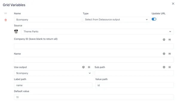
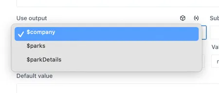
Under the “Use output” dropdown, select the “$company” output
We do not need to set anything for the “Sub path” in this case because the list of companies is directly under the $company output (recall the data source test output in section 6.2.1).
The Label and Value fields determine what the user will see (the label) vs what the dashboard will use as the value.
From the test of the data source output we did, we know there are two properties for the company (name, id). Use the “name” property for the “Label path” and the “id” property for the “Value path”. This means that the dropdown will display a user-friendly list of names but will pass the id as the value when the variable is used.
We do not need to set a default value here.
You may want to save your work so far by clicking the “Save” button on the Grid variables form and then saving the page.
6.4.3 Configuring the $parks variable
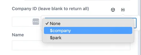
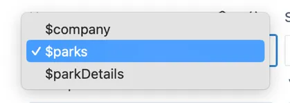
Section titled “6.4.3 Configuring the $parks variable”Click on the “Add variable” button at the bottom of the form to add a second variable. Name this one $park and again set the Type as “Select from Datasource output”.
Select the “Theme Parks” data source again and under the “Company ID” input, click the “(x)” icon on the right to connect this input to one of the page variables; select the $company variable created in the previous step:
Select the “$parks” output from the “Use output” dropdown.
Remember that the data source test output (in section 6.2.1):
Because the output has the path $parks.[0]{.underline}.n, we need to set the “Sub path” as “0”.
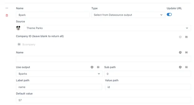
From the six available properties, we will use the “name” property under the “Label path” and the “id” under the “Value path”.
Save the Grid variables form and the page.
6.4.4 Add the select boxes to the page
Section titled “6.4.4 Add the select boxes to the page”Add two “Control” components to the page:
Configure the first control to use the “$company” variable under the “Format Value” section:
And enter the text “Company” in the “Format Label” section:
Repeat this for the second Control, but this time using the “$parks” variable. The controls should now look something like this:
6.4.5 Configure a table to use the variables
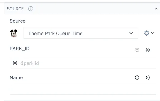
Section titled “6.4.5 Configure a table to use the variables”Add a “Data table” component to the page.
In the Source section, select the Theme Park Queue Time data source. The input for the “PARK_ID” will appear below. Click the “(x)” icon on the right to connect this input to one of the page variables and select the “$Park” variable. In the “select” dropdown below the variable, select the “id” property.
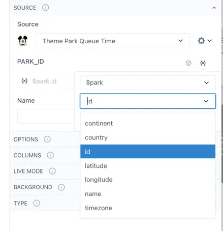
The table Source section should now look like this:
Now configure the table in the normal way, making columns for the Ride, Land, Queue Time and any other fields you would like.
Save the dashboard.
6.4.6 Sharing the link with a friend
Section titled “6.4.6 Sharing the link with a friend”If the Update URL switch is set to “on” for both variables, the current selection will be “remembered” in the URL to create a shareable link.
For example, if a friend is at Disneyland in Florida (Company ID = 2, Park ID = 16) , you could send them this link:
Note: the URL of the page you have made will be different
How do I add a background Image
Section titled “How do I add a background Image”There are two ways to add a background image in a dashboard and each option caters to a different need.
Fixed background image
Section titled “Fixed background image”If you want to add fixed background image that will cover the whole dashboard, you can open your dashboard in edit mode, select Grid settings on the right-side menu and then Background. Upload and crop the background image as desired and then select save. This image will be on the bottom layer of the dashboard, therefore, all other widgets or graphics implemented to it will be on top of the image. This option is ideal if you wish to set a common background for your pages based on the company colors. Next, we have an example of this setting in main view and edit mode. A regular dashboard (not scaled) was used for this example, which is the recommended dashboard for this type of background-fixed scenarios. For more information on this, see section 2.2.2.
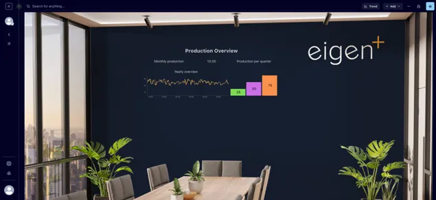
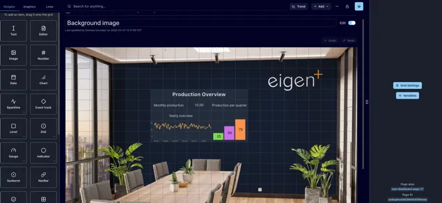
Image Widget
Section titled “Image Widget”If you wish to insert an image in your dashboard that will not be set as background, it is recommended to add an image widget (see section 3.1.3). This will allow you to move the image as desired as well as changing its size. If you wish to overlay this image with other elements, remember to check you have the Prevent collision toggle off in the Grid settings (see section 2.2.1).
How do I select multiple objects
Section titled “How do I select multiple objects”To select a single object, place the mouse pointer over the object and click on it. To select multiple objects, you can either:
-
Hold down the [Shift] key while selecting the individual objects
-
Click and drag the mouse pointer over the objects. In this case every object that is touched by the rectangle will be selected
You can identify all the selected objects by the red line surrounding the item. Once you have selected multiple objects you can move them all by dragging them across the dashboard, copy them or deleting them.
You will also see some options on the left-side menu to align the selected items vertically or horizontally.
How do I group objects
Section titled “How do I group objects”Either select them and right-click and select “Group” or add a group object and drag the components into it.
How do I remove objects from a group
Section titled “How do I remove objects from a group”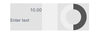
To remove an object from a group but keep it in the dashboard, drag the item outside the group element and place in the desired position.
If you wish to delete an object in a group, select the specific object to erase and click the Delete or Backspace button. Make sure you have selected the item and not the whole group, if you selected the whole group and click delete this will remove all the group and widgets in it. Remember you have the Undo and Redo buttons in case you are not happy with the changes. Pressing Ctrl + Z also works to Undo your latest changes.
Why can I not select a group to move it?
Section titled “Why can I not select a group to move it?”This is probably because the objects take up all the space in the group and there is no “free” space in the group that you can click on. Because of the way layers work, smaller objects are always on top of larger objects, the objects in the group will always be selected first. The only option here is to drag one of the objects out of the group, resize the group slightly (so that there will be some free space), and then drag the object in. Below you can see an example of a group with top “free” space denoted by its lighter color compared to the space where the widgets are located.
How to sync widgets and charts
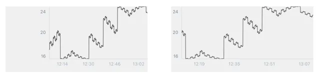
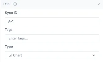
Section titled “How to sync widgets and charts”You can sync widgets within a dashboard by adding a Sync ID to the widgets you wish to sync together. The Sync ID can be letters, numbers and the special characters ”-” , ”,”, ”.” and ”- ”. You can set the Sync ID by selecting the widget in your dashboards, opening the “Type” option in the right-side menu and typing it in the “Sync ID” space. Remember that it is case sensitive, so be sure the Sync IDs are an exact match.
In this example, both charts are synced so when you hover over one of them, it shows the value of both charts. This allows you to evaluate several trends at the same time across charts.
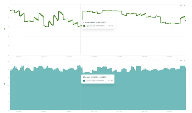
If both charts are displaying the same time span as we have in the previous example, the lines will be aligned one on top of the other. If the charts are displaying different time spans as the next charts, the lines will not be aligned but will still be synced, both displaying the data for the same date and time.
My Control component shows [object Object] rather than the list of values
Section titled “My Control component shows [object Object] rather than the list of values”Make sure the connected variable is prefixed with a dollar sign ($)
For more information please contact us at info@eigen.co or book a demo on our website at www.eigen.co