

Charts in Ingenuity 7
1 An Introduction to Charts in Ingenuity 7
Section titled “1 An Introduction to Charts in Ingenuity 7”Ingenuity provides capabilities to visualize data from different sources such as process data historians (InfoPlus.21, PI-System, Cognite CDF, InfluxDB), production reporting systems (EC, Mikon), OPC sources, relational databases (MSSQL, Oracle) and APIs (weather data, oil price etc).
The Charting Widget is one of many versatile and powerful visualization tools within Ingenuity that offers the following capabilities:
-
Seamlessly drill down into underlying data for deeper insights.
-
Effortlessly create custom charts with the intuitive chart builder.
-
Leverage multiple Y-axes to combine and compare diverse datasets effectively.
-
Live mode enabling real-time trending.
-
Ability to create mini-trends and sparklines that augment process graphics and dashboards.
2 Creating a new Chart
Section titled “2 Creating a new Chart”2.1 Creating a new Chart
Section titled “2.1 Creating a new Chart”There are two really simple ways to create a new Chart.
-
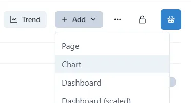
Click the Add button at the top of the Home page, and select Chart from the drop-down
-
Click Charts in the left-hand menu
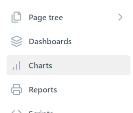
and then click New Chart in the top right-hand corner
2.2 What’s on the Page?
Section titled “2.2 What’s on the Page?”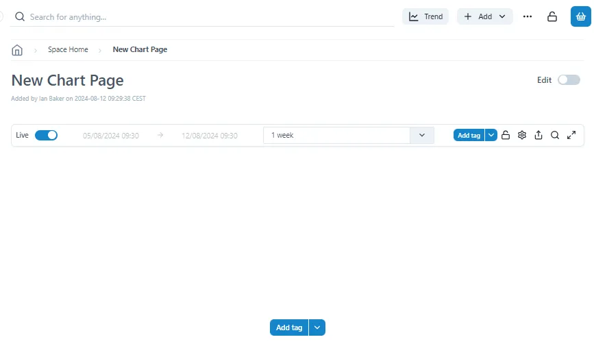
The New Chart page contains just the title bar and a blank chart. The first thing to do it add a series to the chart
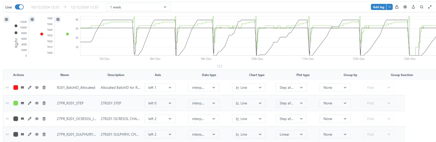
2.3 Add the First Tag
Section titled “2.3 Add the First Tag”To add a Tag to a Chart, simply click either of the Add Tag buttons.
There are two parts to the button: the ‘Add tag’ text on the left, and the V dropdown on the right.
- ‘Add tag’ button:
The ‘Add tag’ button is used when tags to be added to a chart come from a historian data source.
Click on Add tag to search for and select a tag
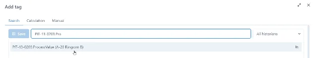
If searching for a tag within a specific historian, select a historian from a dropdown then search for and select a tag.
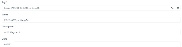
As an option, once a tag is selected Name, Description and Units retrieved from a data source can be modified by a user.
Click Save to add a tag to a chart.
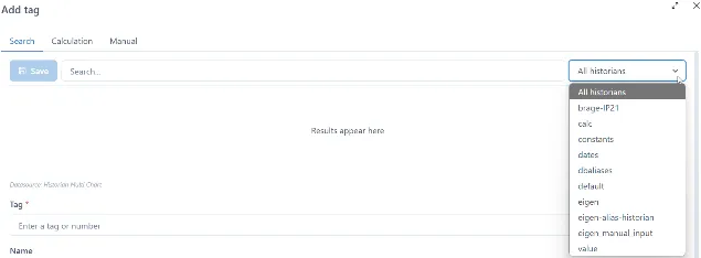
- ‘Add tag’ V Dropdown:
The V dropdown is used when tags to be trended come from either historian or non-historian data sources. Each data source will have data source specific configurations.
Click the V dropdown to select one of the configured data sources.
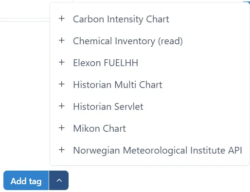
Fill out the data source specific chart configuration parameters. The example below shows Norwegian Meteorological Institute API :
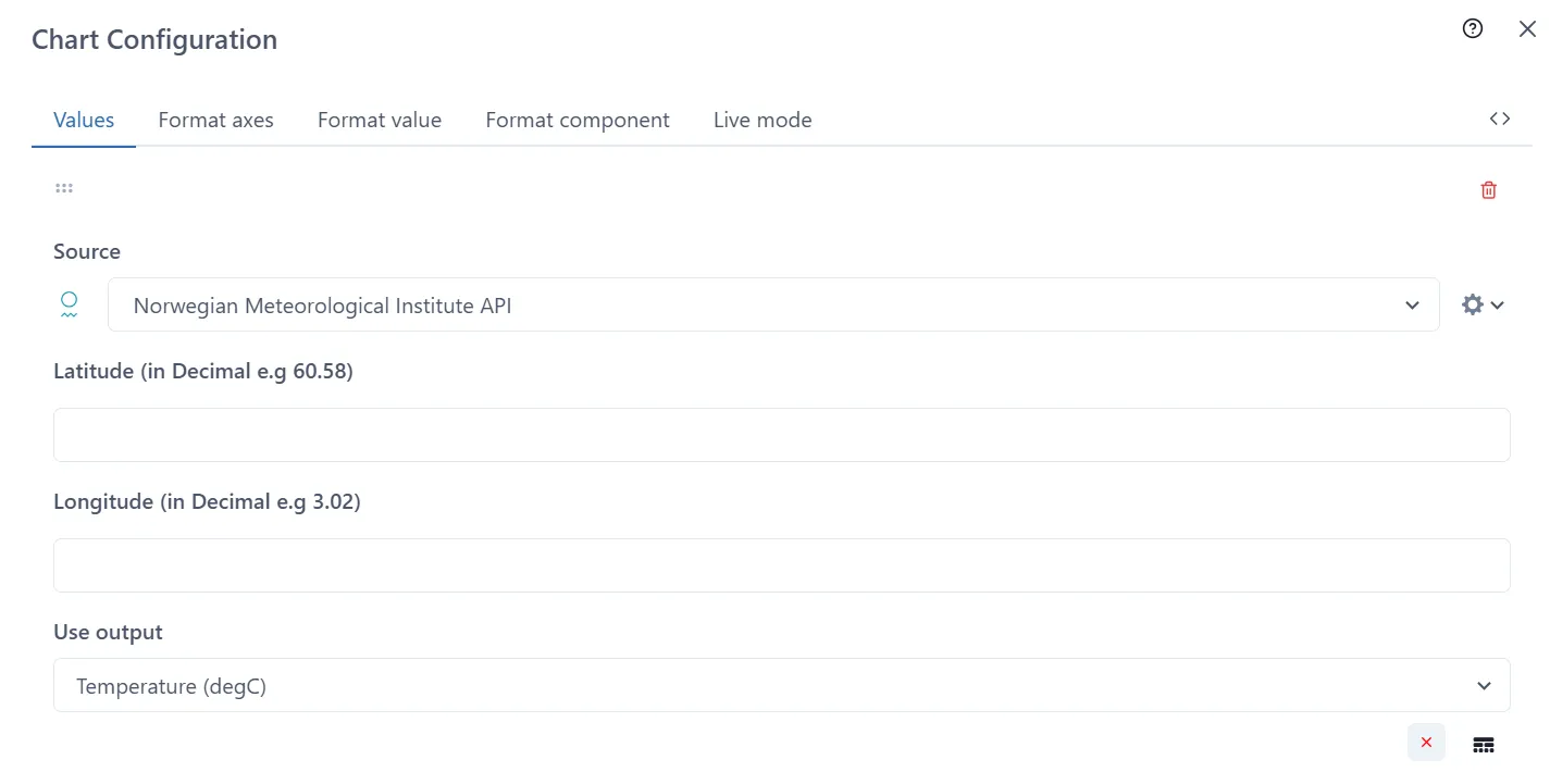
Click Save button when done

2.4 Adding more Tags
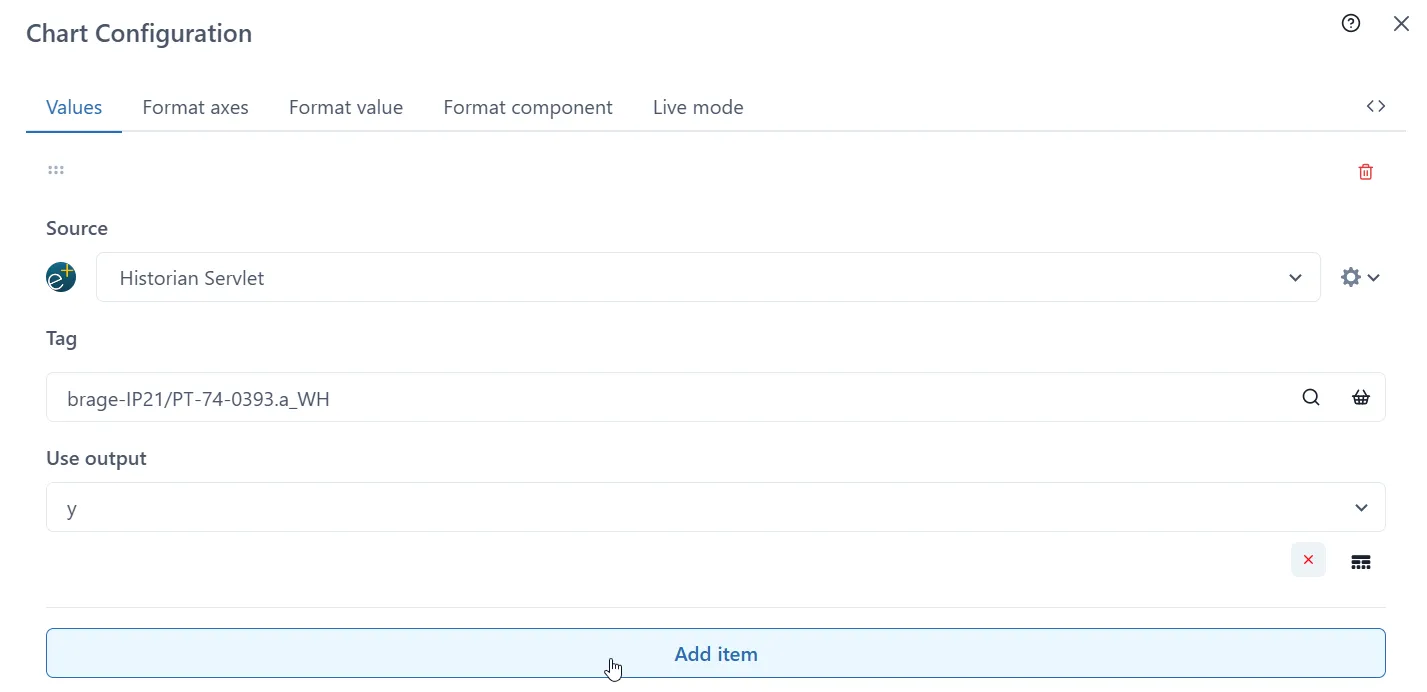
Section titled “2.4 Adding more Tags”To add more than one tag to a chart Click the V dropdown and select one of the data sources listed. The example below shows Historian Servlet:
Click on the magnifying glass icon to search or the basket to select saved tags
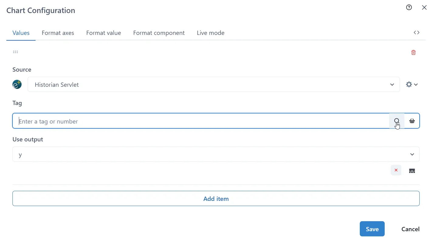
Once the first selection is made, click ‘Add item’ button. New section will be added to the form each time ‘Add Item’ is pressed.
Keep the previous Source or select a new one from the dropdown menu.
The form appended depends on the type of Source selected.
Once the process is repeated for every tag, press the Save button.
2.5 Formatting a Series
Section titled “2.5 Formatting a Series”2.5.1 Series Settings
Section titled “2.5.1 Series Settings”
Below the chart are the settings for each series. If they are not visible, then simply click and drag the 6-dot icon shown above (centre of the page under the chart) up to reveal the settings. It is also possible to hide the settings by dragging the icon down.
2.5.2 Actions
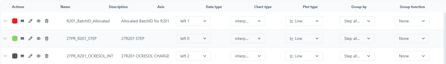
Section titled “2.5.2 Actions”For each Series, there are many things that are configurable.
 | To re-order the series, drag the 6-dot icon up or down. |
 | The Serie colour can be changed by clicking the colour dot. |
 | To change the style of the line, click this icon. It is possible to change the line style (solid, dash, dot etc.) as well as the weight. |
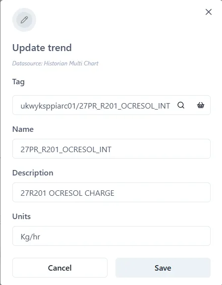
 | Set or change the Name, Description and Units of the Series using the ‘pen’ icon. |
 | Clicking the ‘eye’ icon hides or unhides the series on the chart. |
 | A Serie can be deleted by clicking the bin icon. |
2.5.3 Name, Description and Units
Section titled “2.5.3 Name, Description and Units”As well as clicking the pen icon,
, right clicking the Name or Description allows these to
be changed.
2.5.4 Axis
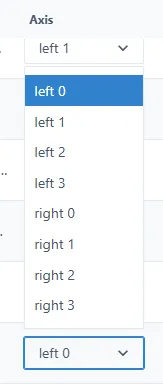
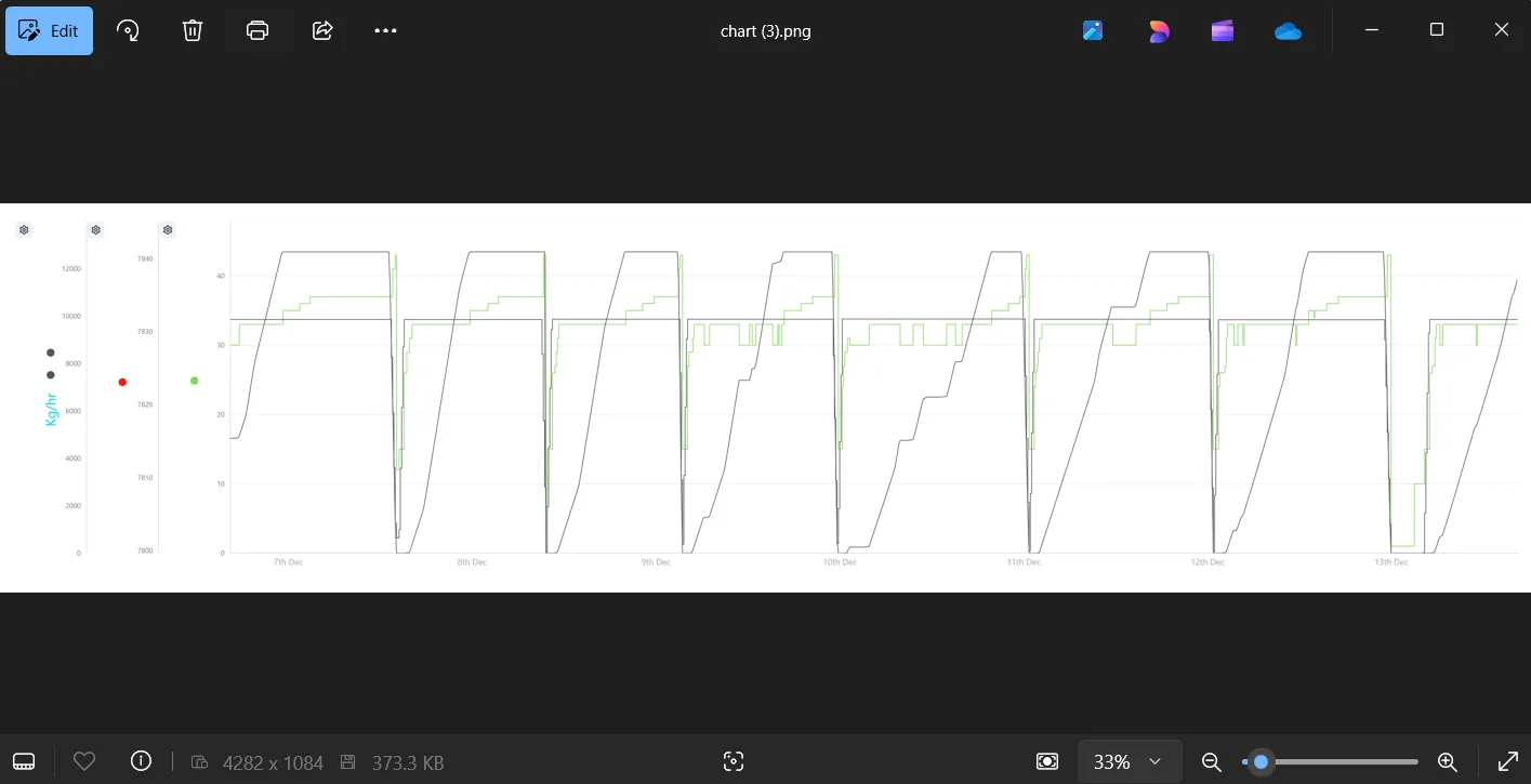
Section titled “2.5.4 Axis”The values of the different Series on the chart may well have quite different range values. It is therefore possible to have each Series plotted against a different axis (up to a maximum of 8 axes). There are four on the left, and four on the right. Simply choose which axis to use from the dropdown list. See sections 2.7.8 and Error! Reference source not found. for details on how to change the format of the axes if necessary.
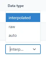
2.5.5 Data type
Section titled “2.5.5 Data type”Choose the type of data for the Serie from the Data Type dropdown. The options are Raw, Interpolated and Auto.
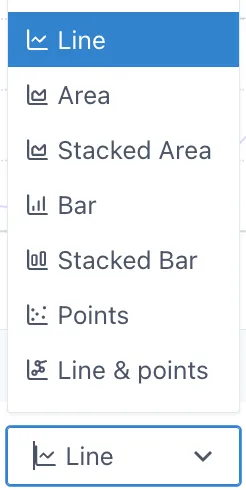
2.5.6 Chart type
Section titled “2.5.6 Chart type”By default, a new Serie is displayed as a Line. But other types of charts are available: Area, Stacked Area, Bar, Stacked Bar, Points and Line & Points.
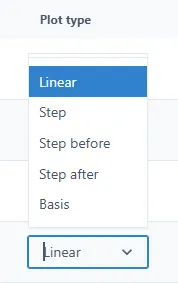
2.5.7 Plot type
Section titled “2.5.7 Plot type”By default, the chart is plotted using a line. But it is possible to display a stepped function instead. This is chosen in this setting.
2.5.8 Grouping
Section titled “2.5.8 Grouping”It is possible to group data, rather than showing every single point in the chart. For example, if there are many data per day, it is possible to show, the First point, the average, the highest or lowest and so on. This is controlled by two values: the range over which to group the data, and the data to show. These are set in the Group by and Group function fields in the Settings.
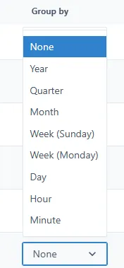
Group by
Section titled “Group by”The possible values are: None (default), Year, Quarter, Month, Week (Sunday — Sunday), Week (Monday-Monday), Day, Hour, Minute.
Group function
Section titled “Group function”The Grouping functions are: First, Last, MAX, MIN, Average, Sum, Count.
This field is disabled if Group by is set to None.
2.6 Title bar
Section titled “2.6 Title bar”
2.6.1 Setting the Chart Time Range
Section titled “2.6.1 Setting the Chart Time Range”Above the chart are the controls to set the chart’s time range.
There are two modes: Live and not Live.
In Live mode, the chart end date/time is the current time. The start date/time is determined by choosing a duration from the dropdown. There are some pre-configured durations, or it is possible to create a custom duration.
In non-live mode, simply set the desired start and end times, and click the Go button. In this mode, the end date does not update in real-time, unlike in Live mode.
2.6.2 Padlock
Section titled “2.6.2 Padlock”Use the padlock to lock the chart format and prevent accidental changes.
2.6.3 Settings
Section titled “2.6.3 Settings”See section 2.7, below.
2.6.4 Share
Section titled “2.6.4 Share”This creates a copy of the chart and provides the opportunity to save and share the URL of the copy with other users.
2.6.5 Examine
Section titled “2.6.5 Examine”Opens a copy of the chart in a pop-up. Any changes made to the chart can be saved to the original.
2.6.6 Seamless mode
Section titled “2.6.6 Seamless mode”Switch to Seamless mode. Charts in Seamless mode don’t show the title bar. This is useful for dashboards and reports where a clean, uncluttered look is required. There are further options for adjusting how a chart is displayed in the “Settings” menus — see section 2.7.
To switch between Seamless and normal mode click the icon
Seamless mode
Section titled “Seamless mode”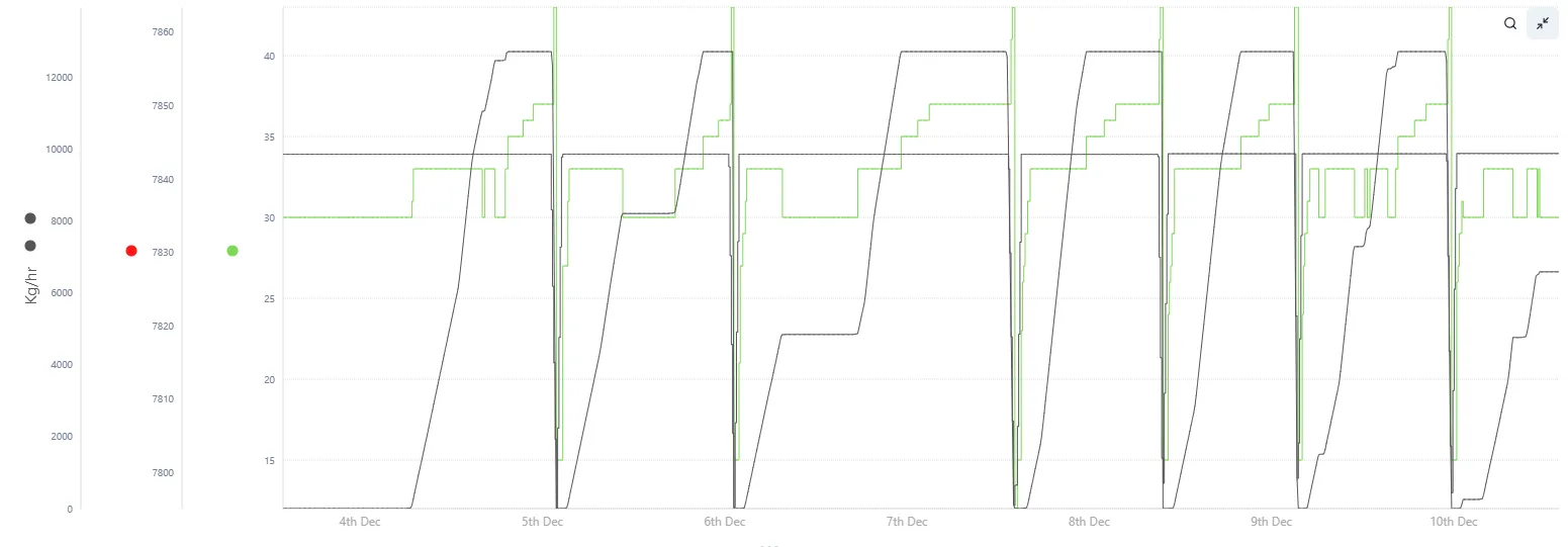
Normal mode
Section titled “Normal mode”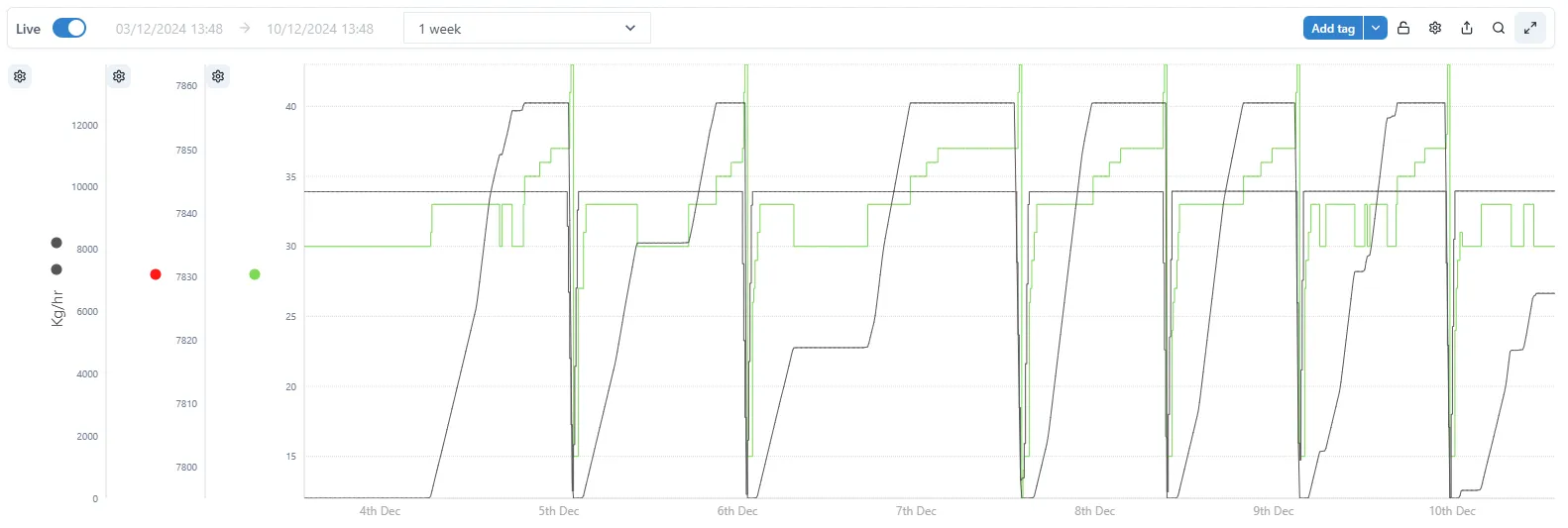
2.7 Configuring the display options for a chart
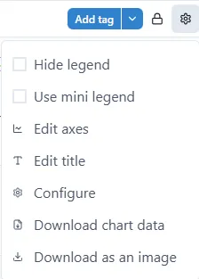
Section titled “2.7 Configuring the display options for a chart”The simplest way to access the Chart Configuration options is to click the Settings Cog icon next to the padlock in the title bar, and then select Configure in the drop-down list.
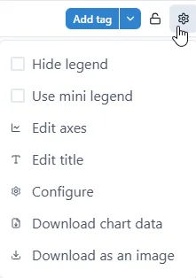
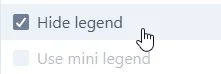
2.7.1 Chart Settings — Hide Legend
Section titled “2.7.1 Chart Settings — Hide Legend”Full legend can take significant amount of dashboard’s real-estate.
Hide and unhide the legend under the main chart area by ticking ‘Hide legend’. This saves space if multiple charts are used within a single dashboard.
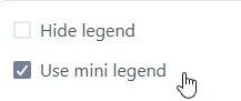
2.7.2 Chart Settings — Use mini legend
Section titled “2.7.2 Chart Settings — Use mini legend”Mini legend occupied very little real-estate on a dashboard, therefore it provides the middle point between full legend and no legend (Hide Legend). Mini legend only displays trend (pen) color and name.
To switch to mini legend tick ‘Use mini legend’.
2.7.3 Chart Settings — Edit axes
Section titled “2.7.3 Chart Settings — Edit axes”Edit chart axes by clicking ‘Edit axes’.
All axes used in a chart are listed and can be edited.
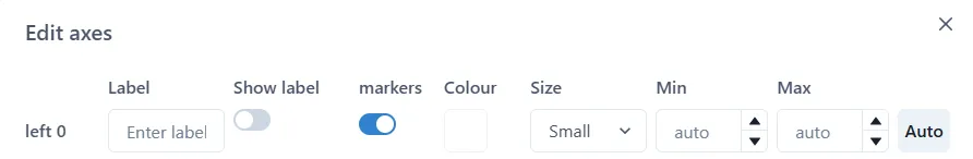
Type the axis label.
Show label
Section titled “Show label”Toggle the selection off or on to hide or show the label on an axis.
Markers
Section titled “Markers”Toggle the selection off or on to hide or show the markers on an axis.
Colour
Section titled “Colour”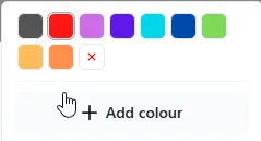
Select the axis label colour. Note: this is not the colour of the axis itself, which is always black.
Select the size of the axis label. Note: this is not the size of the axis itself.
Axis Min value can be set manually by typing the values or using up/down arrows. If set to ‘auto’ the chart will auto scale according to the data lower range.
Axis Max value can be set manually by typing the value or using up/down arrows. If set to ‘auto’ the chart will auto scale according to the tag data upper range.
Set both Min and Max axis value to scale according to the tags data range.
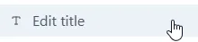
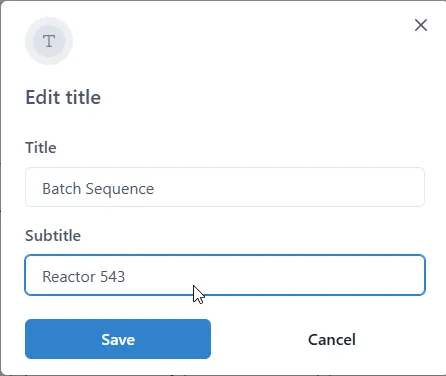
2.7.4 Chart Settings — Edit title
Section titled “2.7.4 Chart Settings — Edit title”Edit chart title by clicking ‘Edit title’.
Type chart title and subtitle
2.7.5 Chart Settings - Download Chart Data
Section titled “2.7.5 Chart Settings - Download Chart Data”To download/export the chart time-series data in CSV format click ‘Download Chart Data’.
The format and the amount of data can be adjusted prior to the export. The ‘Download chart data’ popup also shows the preview of the data.
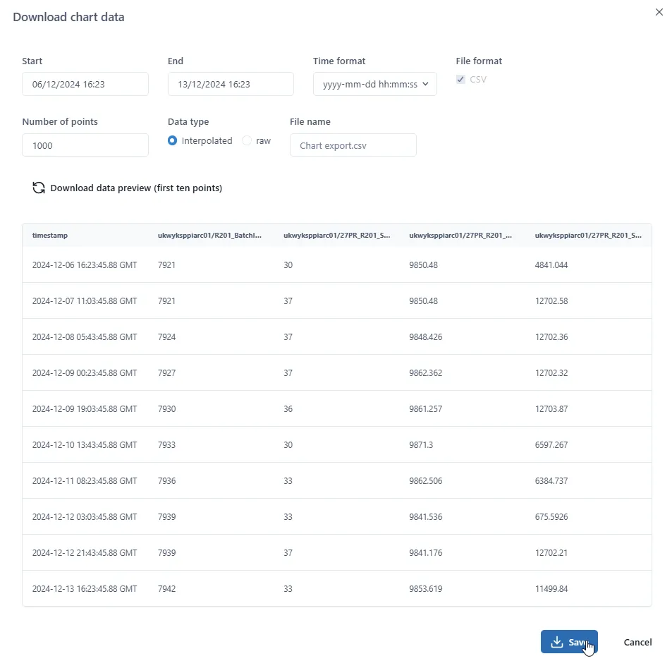
Start / End
Section titled “Start / End”Start and End date/time selection enables user to define the export time window. Default is the chart time window.
Time Format
Section titled “Time Format”Time format can be selected from the dropdown from the list of predefined formats or entirely specified by a user.
File Format
Section titled “File Format”File format is CSV and cannot be changed by a user.
Number of points
Section titled “Number of points”Specifies the maximum number of data points (time series records) to be exported.
Data type
Section titled “Data type”The user can select whether ‘Raw’ or ‘Interpolated’ (sampled) data to be exported by selecting one of the radio buttons.
File Name
Section titled “File Name”The file name can be specified by a user. The destination is always to the \Download folder.
Download data preview (first ten points)
Section titled “Download data preview (first ten points)”If one or more parameters are changed click to reload the preview.
2.7.6 Chart Settings - Download as an image
Section titled “2.7.6 Chart Settings - Download as an image”To download the chart image, click ‘Download Chart Data’.
The image is downloaded to the \Downloads folder in png format.
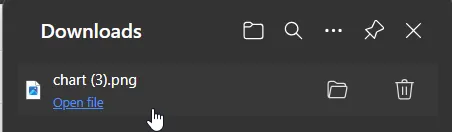
The image can be open with any photo viewer supporting png format.
2.7.7 Chart Settings - Configure
Section titled “2.7.7 Chart Settings - Configure”
This then presents the main Chart Configuration window. ‘Values’ tab appears as default:
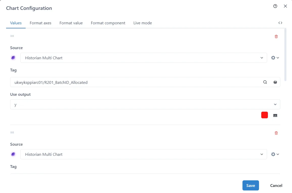
There are five sets of data that can be configured: Values (i.e. data sources), Axes Format, Data Values, Components, and Live mode.
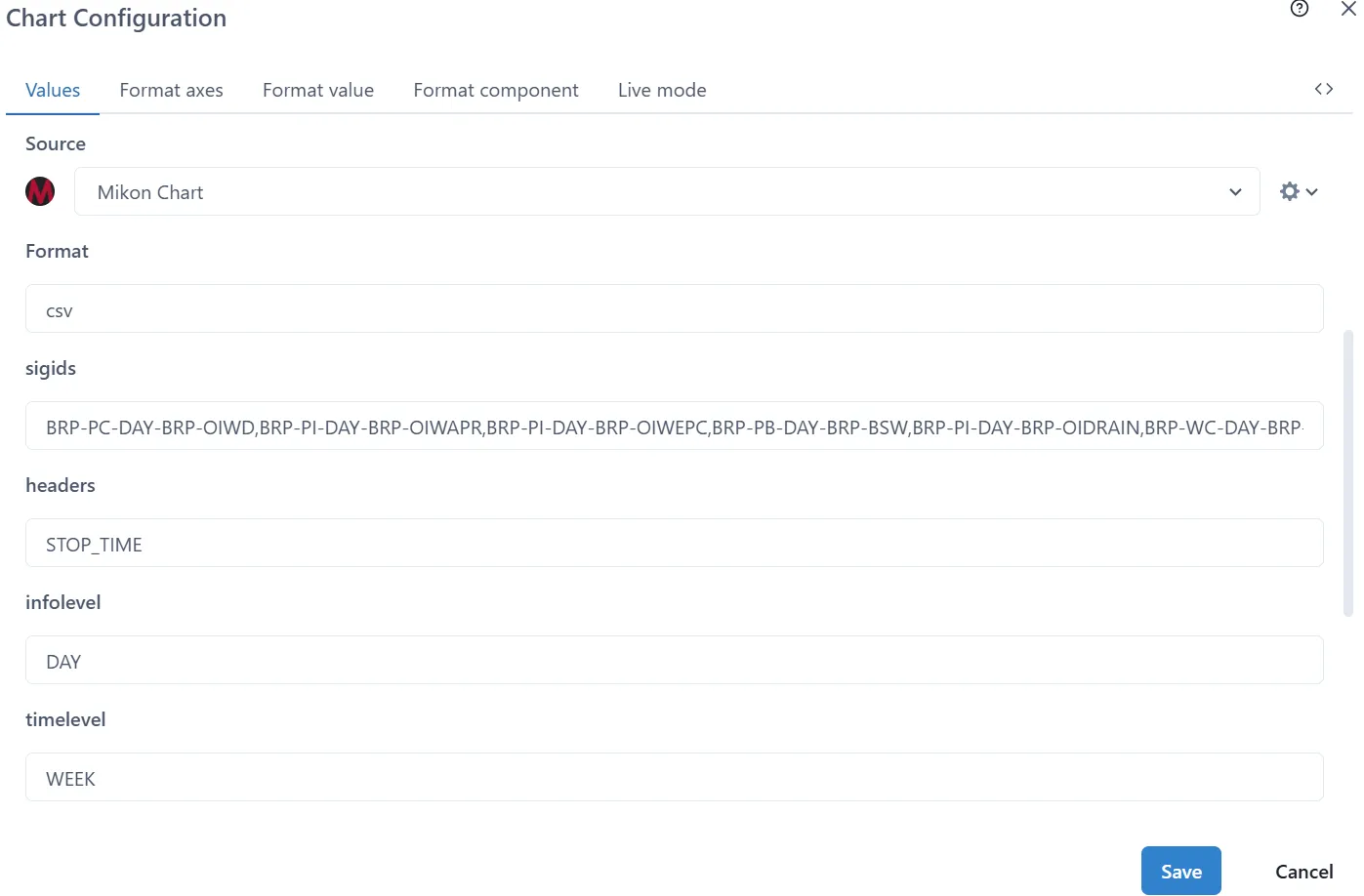
2.7.7.1.1 Chart Configuration - Values (Format Data Sources)
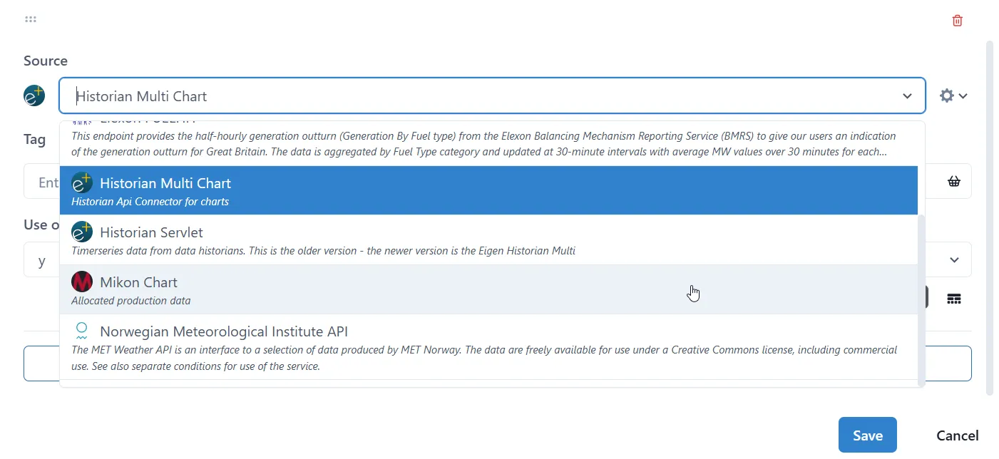
Section titled “2.7.7.1.1 Chart Configuration - Values (Format Data Sources)”It is possible to configure each tag series in chart in this menu. The configuration parameters depend on the type of source selected and its input/output configuration. The common parameter is Source. The Historian Multi Chart (default) data source has 3 parameters:
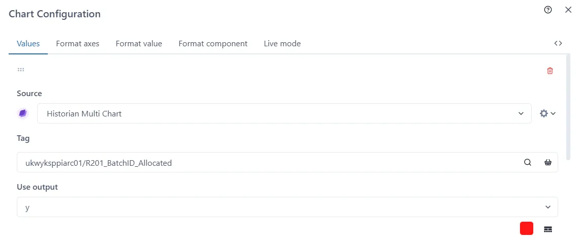
Source
Section titled “Source”Select the source for the data from the drop-down list.
Select the tag by searching or by selecting from the basket.
Use Output
Section titled “Use Output”Select the output parameter from the dropdown list.
Line configuration:
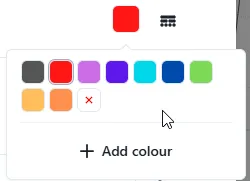
Colour
Section titled “Colour”Set by clicking the red square. Any of the standard colours can be selected or additional colours can be added
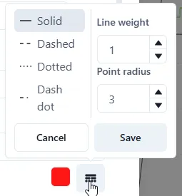
Line Type, Line Weight, Point Radius
Section titled “Line Type, Line Weight, Point Radius”Set by clicking the lines type icon. Select one of the following line types: solid, dashed, dotted, dash dot. Set Line Weight and Point Radius by clicking up/down arrows or manually enter value.
2.7.7.1.2 Chart Configuration - Format Axes
Section titled “2.7.7.1.2 Chart Configuration - Format Axes”Each of the axes can be formatted in this tab.
Min and Max values can be set manually by typing the values or using
up/down arrows. If set to ‘auto’ the chart will auto scale according to
the tag range.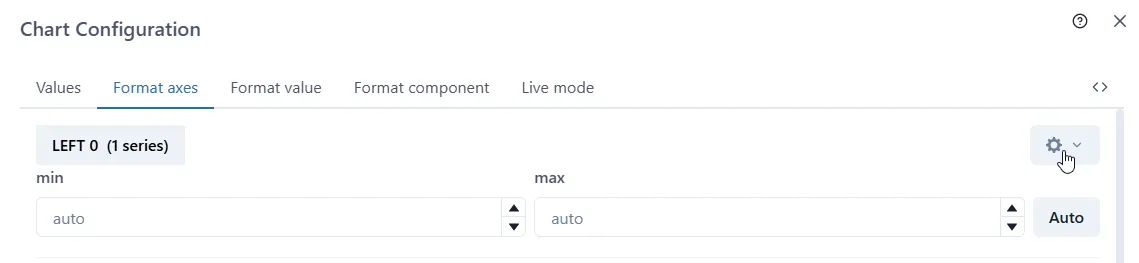 By default, only the min and max
values are shown at first, but other settings can be updated by clicking
the Settings cog on the right of each axis label.
By default, only the min and max
values are shown at first, but other settings can be updated by clicking
the Settings cog on the right of each axis label.
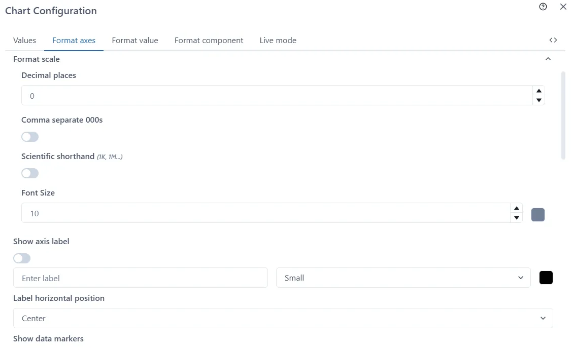
Scale Format
Section titled “Scale Format”Set the number of decimal places, thousands separator (comma or nothing), scientific shorthand notation and font size
Axis Label
Section titled “Axis Label”Set a custom label for the axis. Note: this will replace the units on the axis which are shown by default. It is also possible to configure the font colour and size.
The label can be hidden by toggling the Show axis label switch.
Label horizontal position
Section titled “Label horizontal position”Choose from Left, Centre (default) and Right.
Data markers
Section titled “Data markers”Show or hide the data markers on the axis by toggling this switch. The data markers are the coloured dots indicating which data series are linked to the axis.
Axis width
Section titled “Axis width”Set the width of the axis, in pixels. Using 0 or blank results in automatic width for the axis and is recommended.
2.7.7.1.3 Chart Configuration - Format Value
Section titled “2.7.7.1.3 Chart Configuration - Format Value”Choose the number of decimal places used to display the data values, and whether larger values use comma-separated thousands.
This applies to the values shown in the pop-up when hovering over a chart.
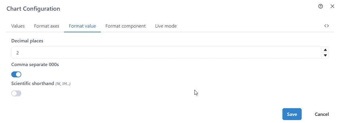
Decimal Places
Section titled “Decimal Places”Manually enter the number (integer) or use up/down arrows to set.
Comma Separate 000s
Section titled “Comma Separate 000s”Toggle the selection off or on.
Scientific Shorthand
Section titled “Scientific Shorthand”Toggle the selection off or on.
2.7.7.1.4 Chart Configuration - Format component
Section titled “2.7.7.1.4 Chart Configuration - Format component”Here are toggles to control the display.
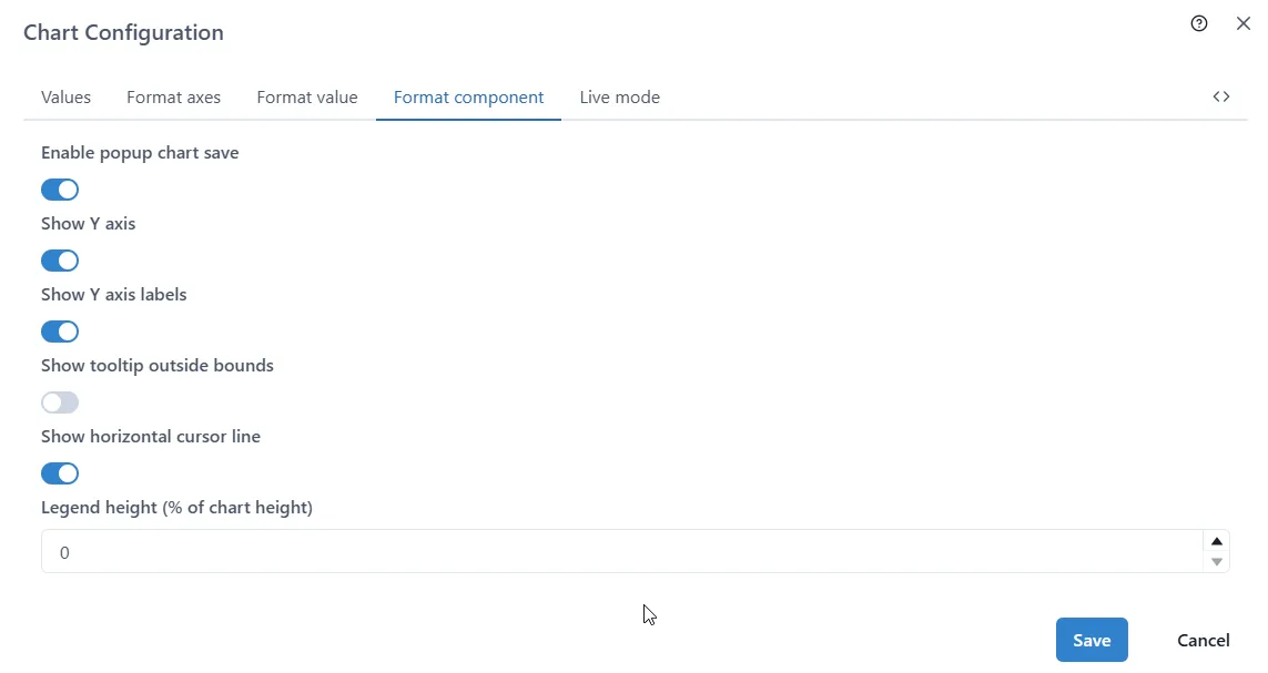
Enable Popup Chart Save*
Section titled “Enable Popup Chart Save*”Toggle the selection off or on.
Show Y axes
Section titled “Show Y axes”Toggle the selection off or on.
Show Y axes labels (these are hidden automatically if the axes are hidden)
Section titled “Show Y axes labels (these are hidden automatically if the axes are hidden)”Toggle the selection off or on.
Show tooltip outside bounds
Section titled “Show tooltip outside bounds”Toggle the selection off or on.
Show horizontal cursor line
Section titled “Show horizontal cursor line”Toggle the selection off or on.
Legend Height (% of chart height)
Section titled “Legend Height (% of chart height)”Manually enter the number (integer) or use up/down arrows to set.
2.7.7.1.5 Chart Configuration - Live mode
Section titled “2.7.7.1.5 Chart Configuration - Live mode”Live can be configured in this tab.
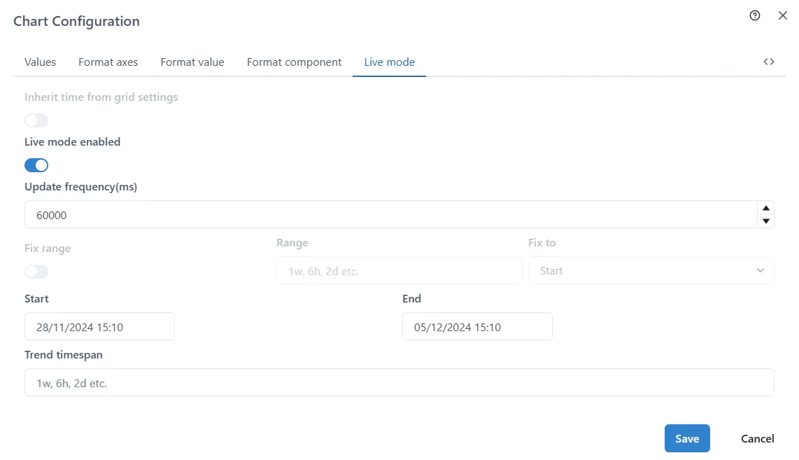
Inherit Time From Grid Settings
Section titled “Inherit Time From Grid Settings”Toggle between Live mode and not.
Live mode enabled
Section titled “Live mode enabled”Toggle between Live mode and not.
Update frequency(ms)
Section titled “Update frequency(ms)”Control how often data is refreshed. Enter the number is milliseconds. For example, enter 1000 to refresh every second, or 60000 for once a minute.
Start and End
Section titled “Start and End”Enter the start and end datetime for the data range. Note that this is not used in Live mode.
Trend Timespan
Section titled “Trend Timespan”Enter the timespan in (w, h, d, etc.) format: eg. 1w, 6h, 2d etc.
2.7.8 Changing Axis scales
Section titled “2.7.8 Changing Axis scales”To change the scale and range of the axis, first make sure the chart is unlocked (see 2.6.2)
Then simply hover over an axis and use the middle mouse button on increase/decrease the size of the range.
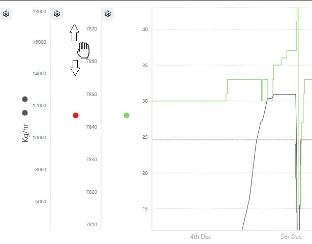
Click and drag to move the axis without changing the scale.
Click the ‘undo’ to go back to how the axis were.
End of Document
For more information, please contact us at info@eigen.co or book a demo on our website at www.eigen.co