

Eigen Ingenuity 7 User Manual
GLOSSARY
| KPI | Key Performance Indicator, also used as a generic term for visualisation components on a dashboard (e.g. Dial, Gauge, Status Indicator etc.) |
| AWS | Amazon Web Services |
| VM | Virtual Machine |
| URL | Universal Resource Locator |
| SQL | Structured Query Language |
1 An Introduction to Ingenuity 7
Section titled “1 An Introduction to Ingenuity 7”Ingenuity is Eigen’s digital platform for Engineering and Industrial Operations. It is built by Engineers, for Engineering and Asset Managers to make working with data a joy. The Ingenuity platform was first written in 2009 and now, 15 years on, Ingenuity 7 is a major new release; a complete re-write from the ground up to include the latest and best technology and incorporate all the learnings we have from over 17 years deploying digital capability for Oil & Gas, Energy, Chemicals and Manufacturing industries. It’s faster, more secure and more intuitive than ever before.
There is a publicly accessible demo of Ingenuity 7 available at https://ingenuity-sandbox.eigen.co/.
1.1 What is Ingenuity
Section titled “1.1 What is Ingenuity”Eigen Ingenuity is a digital platform for getting value from data, improving decision making and automating labour intensive work processes.
It is a layer on top of existing systems and makes it easy way to combine, visualise, publicise and share information from existing systems through online charts, dashboards, reports and automate workflows.
There is no requirement to copy data to a data lake or replace the underlying systems. It is also agnostic, so it is easy to roll out capability across sites with different systems.
1.2 System Licensing
Section titled “1.2 System Licensing”Ingenuity is a cloud-native application and supports multi-tenancy.
Cloud-native means that it is “containerised” to run in a virtual environment (Kubernetes) and is not installed directly onto hardware. It does not mean that it has to be installed in the cloud - it can be installed on-premise on local virtual machines (VM’s) or in a cloud environment such as Microsoft Azure or Amazon AWS.
Multi-tenancy means that a single install can support multiple concurrent subscriptions. A “Subscription” is a digitally segregated set of users, content, datasources and modules.
Ingenuity is licenced “per subscription” and any module licencing applies to that subscription only.
In most on-premise installations there will only be 1 subscription, but the possibility exists to create multiple subscriptions if necessary, for example where a company has business units (in different countries) that must be segregated financially.
Aspects of a Subscription are managed under the Subscriptions module:
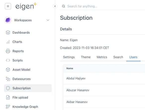
The configuration of a Subscription is managed through the Subscription Module
1.3 Modules
Section titled “1.3 Modules”Ingenuity is now divided into modules to make it easier to navigate and so that individual modules can be licensed separately.
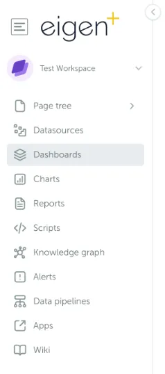
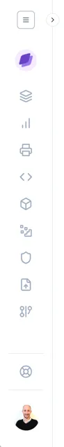
The installed modules are visible on the left had side of the screen:
A summary of the available modules is presented in the table below.
The list of available modules, and if they are a separately licensed from the base install:
| Module | Details | Separate license |
|---|---|---|
| Datasources | Easy overview of all connected datasources | - |
| Dashboards | Create and view live & historic dashboards showing connected data | - |
| Charts | Create and view live and historic charts using connected data | - |
| Calculations | Create virtual timeseries using 30 drag & drop functions | - |
| Reports | Turn any dashboard into a scheduled report and send by email | Yes |
| Scripts | User configurable low code scripting for advanced functionality | Yes |
| Knowledge Graph | Query the Neo4j graph model | Yes |
| Asset Model | An intuitive user interface for browsing the Knowledge Graph | Yes |
| Alerts | Create alerts and get notified if they are triggered | Yes |
| Data Pipelines | Combine and manipulate data to provide cleaned data sets | Yes |
| Document Portal | A simple online portal for storing and searching across ad-hoc docs | Yes |
| Apps | Access to any plug-ins and custom apps | Yes |
| Wiki | Create documentation for easy access within your organisation | Yes |
| Subscription | Admin access to manage your subscription | - |
1.4 Logging in
Section titled “1.4 Logging in”There are two ways to configure the authentication in Ingenuity. This configuration must be done by Eigen during the system setup.:
-
“Single Sign On” - Connecting it to Microsoft Azure (most common); or
-
Local accounts using email & password — good for installations not connected to Microsoft
Logging in with Azure
Section titled “Logging in with Azure”Where an instance is configured to use Azure, users will see this screen on first accessing the system.
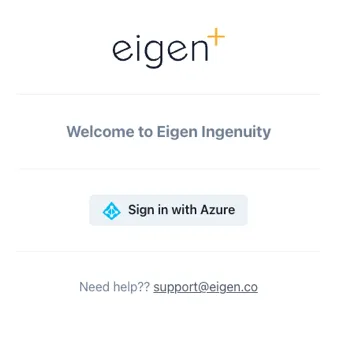
When configured to use the Microsoft Azure Authentication, users will be presented with a “Sign in with Azure” button.
Users must click “Sign in with Azure” and will then be taken through the standard Microsoft authentication process, which will include 2-Factor authentication (such as via Authenticator) if they have set this up.
Logging in with a local account
Section titled “Logging in with a local account”Where local Ingenuity accounts are used, users will be presented with fields to enter their email address and password, as well as a link to reset their password if they have forgotten it.
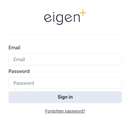
Where local accounts are enabled, users must enter their email address and password.
1.5 User Permissions
Section titled “1.5 User Permissions”There are three basic levels of access available:
-
Admin — can manage users and access
-
User — can view and create content
-
Anonymous
Admins and Users can be added to Groups to make it easy to configure access to Workspaces and other content:
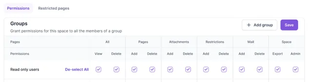
Within a Subscription, user access can be restricted to Workspaces and down to a Page level.
1.5.1 User Management
Section titled “1.5.1 User Management”Users are per-subscription and are managed under the Subscriptions module (Section 2.12).
1.6 Navigation
Section titled “1.6 Navigation”The first page a user will see when they log in is the landing page (for the Subscription they have logged in to if in multi-tenancy mode):
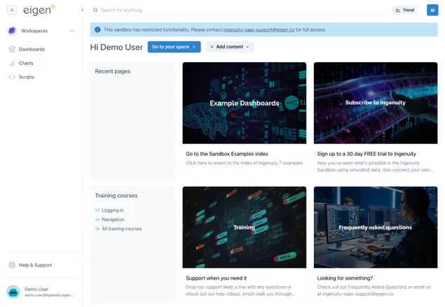
This page gives quick access to recent pages, training courses and four panels with current news or events of interest to users in that Subscription. The content of these four panels is specific to a Subscription and is managed by System Administrators in the Ingenuity Hub (See section 3.2).
1.6.1 Screen areas
Section titled “1.6.1 Screen areas”To make it more intuitive, the screen is now divided into different areas, so that users always know where to look to find the function they need.
Components along the top are always visible unless in Kiosk mode.
Top right
Section titled “Top right”Clicking the site logo will take a user back to the site home page.
Clicking the hamburger button on the left shows the Quicklinks menu.
This is a user configurable, user specific, menu of shortcuts to Ingenuity content or other URLs:
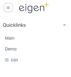
Clicking “Edit” lets a user add and manage their Quicklinks.
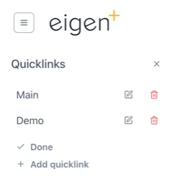
Administrators can set site (Subscription) wide Quicklinks in the Ingenuity Hub
The [<] arrow to the right of the site logo will collapse the side bar so that only the icons are visible.
Top middle
Section titled “Top middle”The Search bar lets users quickly search for data, content or objects in the Knowledge Graph.

The Trend button instantly brings up a blank trend

When the user is on a page that they have edit permissions for, three additional buttons will be visible to Add content, manage content, and manage permissions:
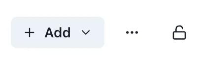
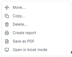
The Manage Content is behind a button with three dots […] to signal that there are more options here. The available options depends on the content of the current page and the user permissions:
Top Right
Section titled “Top Right”The Basket is a way to collect references to data and information that you would like to refer back to.

Left hand panel
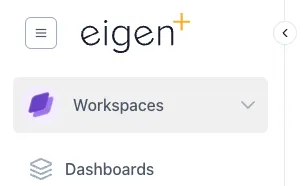
Section titled “Left hand panel”The left hand panel is the main way to navigate within the system. At the top is the Workspace selector (see 1.6.2), access to the Page Tree (see 1.6.3) and the Modules (see section 2).
The left hand panel is the main way to navigate around the system
Bottom Left corner
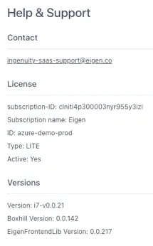
Section titled “Bottom Left corner”The bottom left corner shows the logged in user and a link to the Help and Support page.
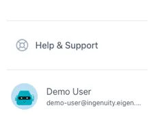
Clicking on “Help and Support” brings up a page with a link to the Eigen support desk, as well as details of the system that may be needed in the case of contacting support, such as the instance name, licence etc.
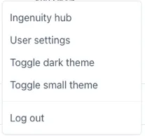
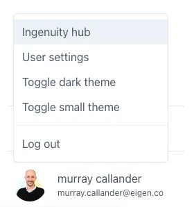
Clicking on the logged in user brings up a menu of available user-specific settings:
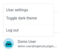
This includes being able to select the Theme (see 1.7), edit user settings and Log Out.
Superusers will have access to Ingenuity Hub
Right hand panel
Section titled “Right hand panel”The right hand panel is only visible when a page is in Edit mode. The content of this panel changes dynamically to show all the available configuration options

Different examples of configuration options
in the right hand panel
Bottom right hand corner
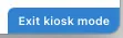
Section titled “Bottom right hand corner”There is normally nothing in the bottom right corner unless the current page is in Kiosk mode (see 1.10). In this case there is a barely visible button to exit Kiosk mode that only appears clickable when the mouse cursor is over it:
 🡪
🡪
1.6.2 Workspaces
Section titled “1.6.2 Workspaces”All content in Ingenuity is arranged in “Workspaces”. Each user has their own personal Workspace, plus shared Workspaces can be created. The Workspaces are accessed from the dropdown in the top right. A user can only access the Workspaces for which they have View or Edit permissions.
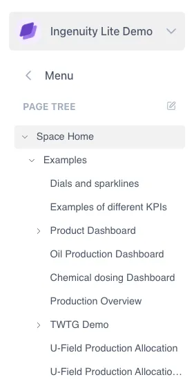
1.6.3 The Page Tree
Section titled “1.6.3 The Page Tree”A Workspace is analogous to a top-level folder. The content within a Workspace is organized in a hierarchy called the Page Tree. On entering a Workspace, the user sees the Page Tree for that Workspace.
If a user has Admin rights to a Workspace, there is an edit icon visible to the right of the “Page Tree” heading. (See Manual Section 14 — Workspaces and Pages).
If a user has Admin rights to a Workspace, there is an edit icon visible to the right of the “Page Tree” heading. (See Manual Section 4 — Workspaces and Pages).
1.7 Themes and Modes
Section titled “1.7 Themes and Modes”Ingenuity supports multiple Themes. A Theme defines how everything appears on the screen, including the colours, fonts and logos. Each Theme has a Light mode &, a Dark mode and Normal & Small modes.
Themes are installed by Eigen but users can select the mode they would like to use by clicking on their user name in the bottom left corner.
1.7.1 Light and Dark Modes
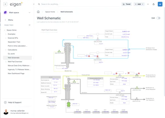
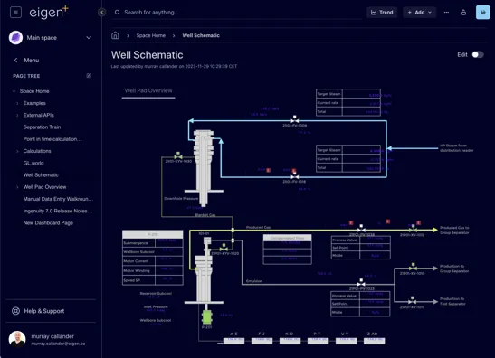
Section titled “1.7.1 Light and Dark Modes”The system comes with default a default Eigen Theme in Light and Dark Mode Themes. The examples below show the same page in Light and Dark modes.
1.7.2 Small and normal modes
Section titled “1.7.2 Small and normal modes”The “Small” mode for a theme is useful where screen space is limited because the side bar and headings take up less room

The lower screenshot shows Small mode makes left panel and the headings take up less room.
1.8 Trending data
Section titled “1.8 Trending data”1.8.1 Quick access to trend data
Section titled “1.8.1 Quick access to trend data”Trending data is essential for engineering and production operations. Very often there is a need to quickly check something and pull up a trend. Ingenuity 7 makes trending data even quicker and easier than before, with a new “Trend” button that is always visible at the top right of the screen, as well as the proven features like fast search, the Basket and drag and drop.
Clicking the new Trend button brings up a blank pop-up trend.
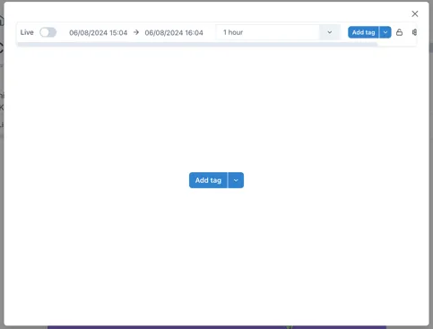
Data can be added to the trend in one of three ways:
-
Searching for a tag by clicking the [Add tag] button

-
Selecting a datasource that provides trendable data from the
 icon to the right of the Add tag button
 -
Dragging and dropping a tag from the Basket..
Other ways to bring up a trend are:
-
Clicking on a value in a dashboard
-
Clicking the “trend” icon by an item in the Basket (see section 1.9).
1.8.2 The new Chart component
Section titled “1.8.2 The new Chart component”The all new Chart component in Ingenuity 7 is more intuitive than ever.
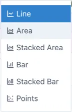
The following chart types are available:
See section 2.3 below for more details, and Product Manual Section 6.
1.9 Creating Content
Section titled “1.9 Creating Content”Everyone likes good looking visuals, especially everyone at Eigen, and Ingenuity 7 makes it even easier to make beautiful dashboards. It also makes it even easier to display these dashboards on public displays with the new Kiosk mode.
1.9.1 Adding a Page, Chart or Dashboard
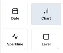
Section titled “1.9.1 Adding a Page, Chart or Dashboard”When a user is in a Workspace for which they have edit permission, the
 button is visible in the top right. There
are 4 different types of content that can be added:
button is visible in the top right. There
are 4 different types of content that can be added:
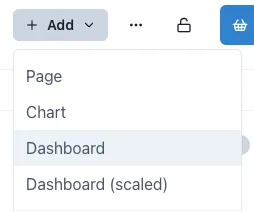
All options look similar, but they have some subtle differences. The most significant difference is the Dashboard (scaled), which does not have a visible layout grid.
-
Page: A blank web page with a layout grid to make it easy to align content. Users can add any content from the palette
-
Chart: A Chart is a Page that is tagged as a Chart (so that it appears in the Charts module) and has a full width chart component added by default. Users can add additional charts and other components in Edit mode.
-
Dashboard: A Dashboard is a blank page that is tagged as a Dashboard so that it appears in the Dashboards module.
-
Dashboard (scaled): this is a Dashboard that does not have a visible layout grid so that components can be freely placed anywhere. This is especially useful for creating dashboards with a background image where pixel level placement accuracy is required.
1.9.2 Edit mode
Section titled “1.9.2 Edit mode”In order to edit a page it must first be put in Edit mode. This is done
by sliding the toggle switch in the top right hand corner
 .
.
When the page is in edit mode, the component pallet is visble on the right, and the layout grid is visible in the page body. Components are added by dragging them from the palette and resizing them as desired. The grid will automatically extend downwards as components are added.
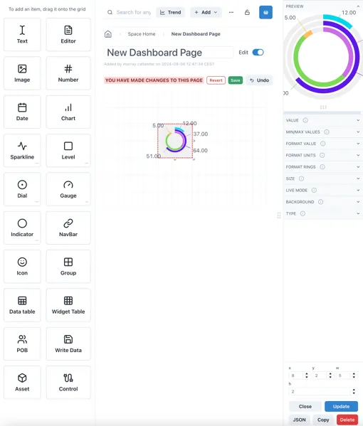
The panel on the right shows the configuration options for the currently selected component (or the grid itself).
1.9.3 Component Templates
Section titled “1.9.3 Component Templates”Many of the available components have a library of pre-configured templates. These are accessed by clicking on the three dots in the bottom right hand corned of the component box:
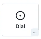
This will bring up a popup of the available templates.
Click and hold on the [Drag to grid] button on the one you would like to use and you will be able to place it on the page grid.
1.9.4 Saving or reverting changes
Section titled “1.9.4 Saving or reverting changes”As soon as the content on a page is changed, Save or Revert buttons appear at the top:

It is possible to go in and out of Edit mode without losing changes, but changes must be saved before navigating away from the page, otherwise all changes will be lost.
1.10 Displaying content — Kiosk Mode
Section titled “1.10 Displaying content — Kiosk Mode”Kiosk Mode is used for displaying Dashboards on public displays. I removes all the application navigation and headers so that the content can take up the whole screen.
Normal view: Kiosk mode:
To exit Kiosk mode, there is a subtle button at the bottom right of the screen that only appears clickable when the mouse cursor is over it:
🡪
1.11 Collecting Data - The Basket
Section titled “1.11 Collecting Data - The Basket”The Basket is a way to collect references to data and information that you would like to refer back to.
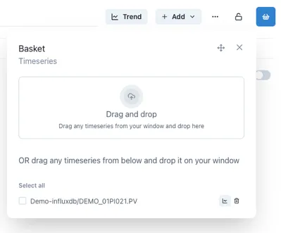
Much like the shopping basket on a website, a used can add things to their basket and come back to them later.
The Save and Load functions provide a handy way to create personal lists of useful information that is regularly accessed.
1.12 Search
Section titled “1.12 Search”The Search bar lets users quickly search for data, content or objects in the Knowledge Graph.
The search results will appear in a slide-out on the right hand side of the page.
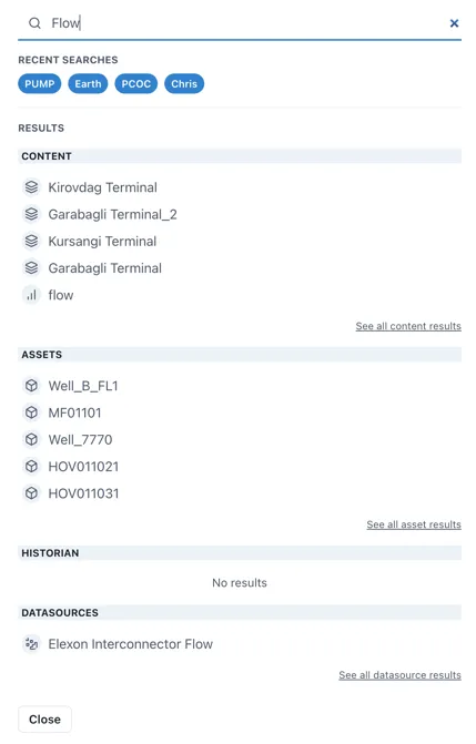
Search results are interactive and will take the user to the live instance of the result.
1.12.1 The Common Menu
Section titled “1.12.1 The Common Menu”Clicking on a result in the Assets section will bring up the Common Menu. This shows all the related information in the Knowledge Graph and includes live links to referenced information such as drawings, timeseries data and other assets.
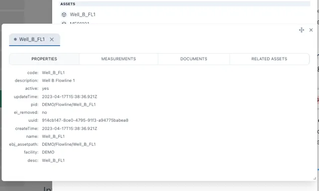
The Common Menu shows all the related information in the Knowledge Graph
2 Modules
Section titled “2 Modules”2.1 Datasources
Section titled “2.1 Datasources”The Datasources module shows all the data sources currently installed along with a description and examples.
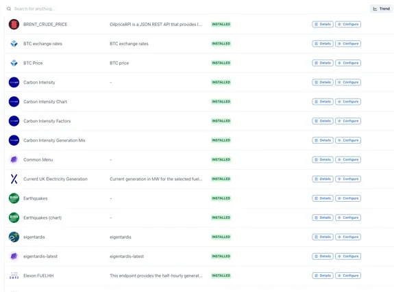
Each data source supports one or more types of display component, for example, a Chart, Value, Table etc.
Clicking on the “Details” button to the right of any data source brings out a slider with full details of the data available plus a button to test it and see the response
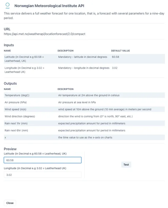
Clicking the “Test” button at the bottom right shows the direct response from the data source on the left and the refined output provided to the Ingenuity component on the right
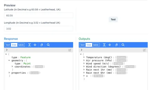
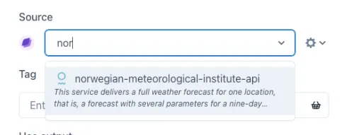
These data sources appear under the Source dropdown for configurable display elements (trend, KPI, sparkline, table etc.).
2.1.1 Types of datasource
Section titled “2.1.1 Types of datasource”There are four types of data source:
-
Value: Supports the minimum requirements to display a single value (for a point in time) in a KPI
-
Multi Value: Provides set of single value outputs at point in time, for display in a KPI. For example temperature, pressure & rainfall for a given location.
-
Table: Provides a data set that can drive a table. i.e. fields that can be assigned to columns with a variable number of rows
-
Chart: Provides a data set with time as the x axis and one or more series for the y-axes.
The following datasource types will be added [in the future]{.underline}:
-
Map: provide a dataset that will render a map
-
Geo: provide a dataset that can be overlaid on a map
2.1.2 Categories of datasource
Section titled “2.1.2 Categories of datasource”There are 4 categories of datasource:
-
Historian data sources: full featured timeseries data source that supports interpolation. Only Historian sources can be used in Calculations. Historian data sources require an Eigen Historian driver (for example IP.21, Aveva PI, InfluxDB etc.)
-
Internal data sources: these are data sources that connect to components within Ingenuity. They are used by the system but are also available to users, for example the Common Menu. Some of these data sources are “meta” data sources, in that they provide a list of available datasources.
-
Data sources that require a driver: two-part data sources that require a driver installed against the source (for example SQL Server) plus a connector to that driver from the Ingenuity UI.
-
API data sources: These can be configured directly in Ingenuity and connect to 3rd party APIs
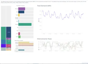
2.2 Dashboards
Section titled “2.2 Dashboards”The Dashboards module contains all the functionality for creating beautiful displays. Clicking on the Dashboards module displays all the dashboards in that Workspace.
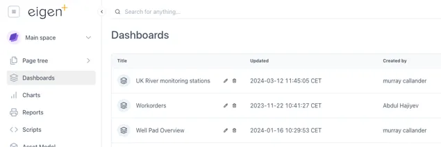
Note that these dashboards will also be listed in the Page Tree. The difference with this view is that there are Edit and Delete icons to make managing the dashboards a bit quicker.
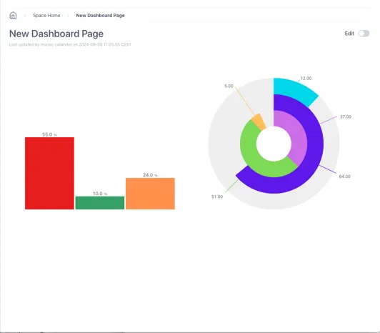
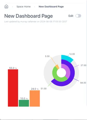
2.2.1 Standard vs Scaled dashboards
Section titled “2.2.1 Standard vs Scaled dashboards”There are two types of dashboard that can be selected in the “Add” content dropdown:
Standard dashboards have a grid and will scale the horizontal dimension only. This means that the spacing between components will be reduced but the text size will remain the same size.
Scaled dashboards will scale both the horizontal and the vertical dimensions. This keeps the aspect ratio the same and is better for keeping everything visible as the screen size changes.
The example below shows the effect of the two different settings on a simple dashboard as the width of the screen is reduced
A simple dashboard with a Level and Dial:
When the width of the window is reduced, the scaled dashboard keeps the same aspect ratio:
Standard:
Scaled:
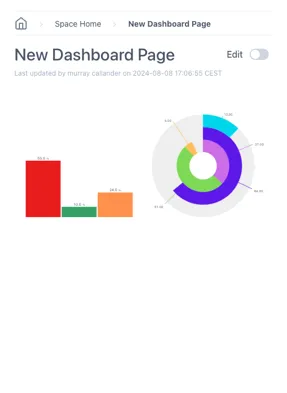
TIP
It is best to use the Scaled dashboard when overlaying data on a background image
2.2.2 Adding Components
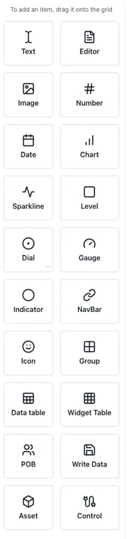
Section titled “2.2.2 Adding Components”Components are added to a dashboard by dragging them in from the left-hand panel. The following components are available:
| Component | Notes | Datasource |
|---|---|---|
| Text | Simple text box for titles & labels | n/a |
| Editor | Inline text editor with formatting for ad-hoc entry in the page | n/a |
| Image | Display an image on the page | n/a |
| Number | Display a formatted number | Value |
| Date | Display a date | Date |
| Chart | The full chart component | Chart |
| Sparkline | Simple trendlines | Chart |
| Level | Vertical or horizontal level indicator | Value |
| Dial | Round indicator | Value |
| Gauge | Dial with needle | Value |
| Indicator | Status indicator, e.g. on/off — shapes or text | Value |
| NavBar | Configurable navigation bar | n/a |
| Icon | Insert from a library of icons | n/a |
| Group | Insert a grouping object | n/a |
| DataTable | Insert a table with number of rows driven by the data source | Table |
| Widget Table | A table of other components | Value |
| POB | A People On Board display (if licenced) | POB |
| Write Data | Button to write data back for write enabled components | Writeable value |
| Asset | Display an object from the Knowledge Graph | KnowledgeGraph |
| Control | Advanced function that can interact with variables and update other components | n/a |
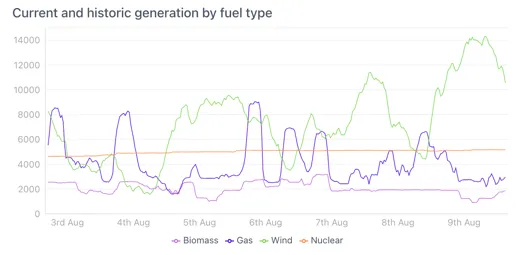
2.3 Charts
Section titled “2.3 Charts”The all-new Ingenuity Chart module is more powerful and more user friendly than ever. A significant change from Ingenuity 6 is that there is one unified chart component that covers all use cases from sparklines to full page charts. The means that all the same charting options are available for both sparklines and full charts.
2.3.1 Chart controls
Section titled “2.3.1 Chart controls”The time range selection and controls for the component are all located in the bar at the top.

Legend
Chart area
Controls
2.3.2 Live mode & setting the time range
Section titled “2.3.2 Live mode & setting the time range”By default, new charts are in Live mode, which means that the right hand side of the chart will be set to the current time and will update every minute.
The time range of the chart can be change by users on the left hand side of the top bar.
Live mode
Section titled “Live mode”In Live mode there is a dropdown with pre-configured intervals or a custom interval can be typed, e.g. 3w = 3 weeks.
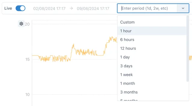
The following are valid entries for time periods:
s: seconds
m: minutes
h: hours
d: days
w: week
y: year
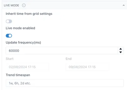
The update frequency for Live mode is configurable in the Live mode section of the chart configuration:
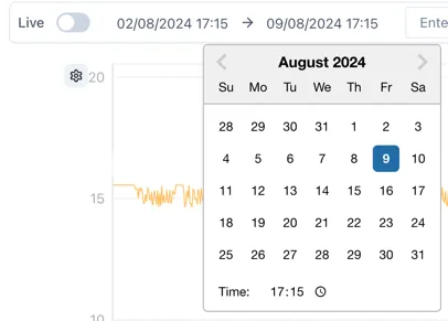
Fixed mode
Section titled “Fixed mode”When Live Mode is deactivated, the chart will not update automatically and an exact start and end time can be selected using the time and date pickers:
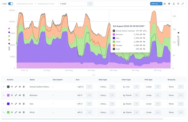
2.3.3 Adding data
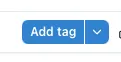
Section titled “2.3.3 Adding data”Data is added to a chart by either dragging and dropping it from the basket, or clicking the Add tag button
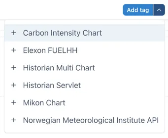
Clicking the arrow on the right side of the Add tag button shows a list of non-Historian data sources that support the Chart type.
2.3.4 Zooming in and the Lock function
Section titled “2.3.4 Zooming in and the Lock function”By default the chart area is “unlocked”. This means a user can click and drag to select an area to zoom in on an area of interest.
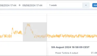
Once zoomed in an undo button appears next to the “Add tag” button to let the user quickly zoom back out.
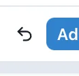
It is possible to zoom in multiple times and the undo button will revert the zooms one at a time.
When the cursor hovers over an axis, the pointer will change to a hand. This shows that the axis can be:
-
zoomed in and out by scrolling the mouse wheel; or
-
shifted up or down (or left/right for the x-axis) by clicking and holding and then moving the mouse.
Sometimes this interactivity is not desirable and so it can be turned off by clicking the lock icon to “Lock” the chart:
 🡪
🡪

2.3.5 Chart Settings Menu
Section titled “2.3.5 Chart Settings Menu”The cog wheel icon on the right of the controls gives access to the Settings menu:

2.3.6 Chart pop-out
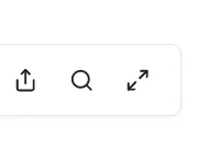
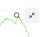
Section titled “2.3.6 Chart pop-out”The magnifying glass will cause the chart to open in a full screen popup window to make it easy to inspect the data in more detail.

Changes in the pop-out chart will not affect the underlying component.
2.3.7 The Legend
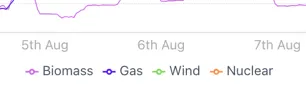
Section titled “2.3.7 The Legend”Users can configure how a series is displayed in the legend at the bottom of the chart.
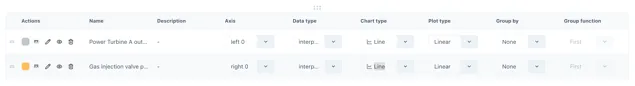
Everything from line style to chart style and axis can be configured here.
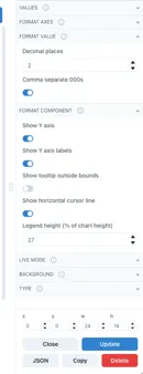
2.3.8 Hiding and minifying the legend
Section titled “2.3.8 Hiding and minifying the legend”The legend can be hidden or minfied via the settings menu, make the chart cleaner better looking in reports and dashboards.
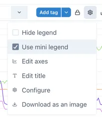
Selecting “Use mini legend” in the Settings menu shows a neat
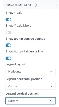
When the legend is in “mini” mode, it’s position can be set in the “Format component” section in the Configuration.
2.3.9 Adding markers and comments
Section titled “2.3.9 Adding markers and comments”Pressing the space bar while the cursor is over the chart area will place a marker where the cursor is.
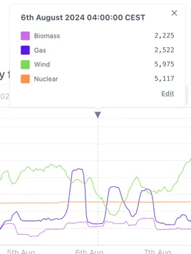
Comments can be added to this marker by clicking the the triangle at the top of the marker and then clicking “Edit”.
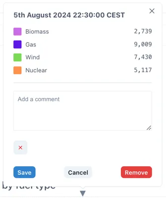
Comments are saved locally on within the page (so will be visible to anyone else who views the page) but are not written back to the source data.
2.3.10 Charts vs Sparklines
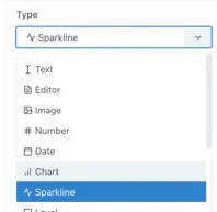
Section titled “2.3.10 Charts vs Sparklines”Although the component is the same behind the scenes, sparklines are presented as different components when adding to a page because they have a different set of default parameters (for example all the controls and the legend are hidden):
Charts can be converted to sparklines, and vice versa, in the Type selection in the component configuration:
2.3.11 Seamless mode
Section titled “2.3.11 Seamless mode”Seamless mode hides the top bar with the controls to prevent users changing the time range and to make the chart look clean and neat in dashboards and reports:
This is an example of a chart in seamless mode with a mini-legend.
To exit seamless mode, a button appears when the cursor is over the top right corner of the chart.
2.4 Calculations & Synthetic timeseries
Section titled “2.4 Calculations & Synthetic timeseries”Synthetic timeseries are datasets that are either derived based on existing data (for example taking an average), a generated set of points based on a constant or function, or functions on dates. There are four different souces of synthetic timeseries. These are listed below along with their historian prefix:
-
Calculations — calc/
-
Constant values — value/
-
Date values — dates/
-
Generated signals — siggen/
2.4.1 Calculations
Section titled “2.4.1 Calculations”Calculations apply “in-line” transforms to any timeseries data source connected to Ingenuity. There are 30 functions covering everything from simple mathematical operators (Add, Subtract, Multiply, Divide etc.), through to more complex Totalisers and statistical functions like Average and Standard Deviation, logical If..Then functions and complex transforms such as Timeshifting.
The Calculations module is not shown in the left-hand panel because it behaves as a Historian datasource. It is accessible from any component that can take a Historian datasource.
Available functions
Section titled “Available functions”The list of functions is shown below. See the dedicated chapter on Calculations for full details.
| Add | Log | Sum |
|---|---|---|
| Subtract | Power | DIFF |
| Multiply | Average | Maximum |
| Divide | Count | Minimum |
| Percent Deviation | Number of Bad Points | Mean |
| Totalise | Number of Good Points | Median |
| Totalise Raw | Standard Deviation | Standard Deviation |
| Exponential | Variance | Variance |
| Natural Log | Minimum | If Tag Exists |
| Square Root | Maximum | If Equals |
| Stepped | Timeshift | Epoch_Ms |
| Stepped Raw | Point in Time |
Creating Calculations (accessing the Editor)
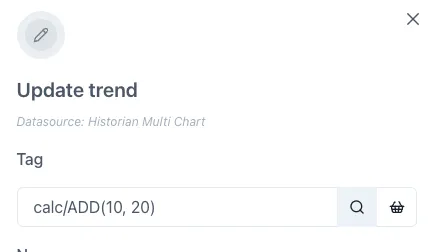
Section titled “Creating Calculations (accessing the Editor)”The Calculation graphical editor is on the “Calculation” tab in the “Edit tag” form.
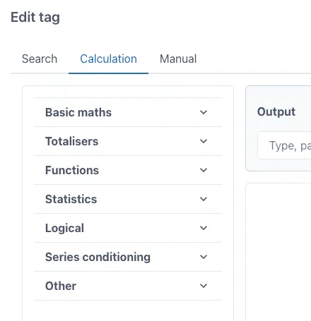
This form appears when the “Add tag” button is clicked on a trend:
Or when the magnifying glass icon is clicked on the right hand side of the tag datasource entry field when editing a tag on a trend or dashboard:
Editing the Calculation Equations
Section titled “Editing the Calculation Equations”Ingenuity 7’s virtual calculation graphical editor is an easy-to-use drag-and-drop user interface in which any Ingenuity user can quickly configure complex calculations while minimizing human error.
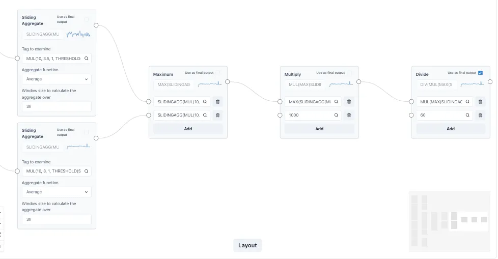
Function blocks are dragged and dropped into a canvas, after which, inputs and outputs can be connected to compose any complex transformation.
Calculations can be linked together to form complex expressions multiple layers deep, and the performance remains fast.
2.4.2 Constant values — value/
Section titled “2.4.2 Constant values — value/”The “value” historian returns a trendable timeseries for constant values. This is useful for displaying reference values on a chart or KPI.
For example, to display a line at 90 on a chart, the following series can be plotted:
value/902.4.3 Date values — dates/
Section titled “2.4.3 Date values — dates/”The “date” historian returns date information about values or relative times. The functions available are:
-
IS_TODAY - Return 1 if given timestamp is today
-
IS_BEFORE_TODAY - Return 1 if given timestamp is before midnight of today
-
DAYS_IN_MONTH - Return number of days in month
-
CURRENT_EPOCH_MS - Return wall clock time in epoch ms
All time values are in epoch milliseconds, which
2.4.4 Signal Generator — siggen/
Section titled “2.4.4 Signal Generator — siggen/”The Signal Generator historian generates synthetic timeseries of known wave forms such as Sine & Cosine, or repeatable random numbers. The syntax is
Syntax is (without the spaces):
\[function\]\[amplitude\]\[+/- y-offset\]@\[period\]\[+/- x-offset\]The x-offset is in seconds from GMT and [does not]{.underline} account for daylight savings adjustments.
For example, a sinewave of amplitudes -10 and 10; offset by -30 (i.e. between -40 and -20), with a period of 600 seconds; offset by -3600 seconds (1 hr) from GMT
sin10-30@600-3600The wave forms available are:
-
sin (sine)
-
cos (cosine)
-
saw (saw wave)
-
sq (square wave)
-
sc (S-curve)
-
rand (repeatable random number)
2.5 Reports
Section titled “2.5 Reports”The Reports module is the solution to automating the creation and distribution of regular reports. It lets users turn any dashboard into an issued report. It also enables auto-creation of the report on schedule.
2.5.1 Creating and scheduling reports
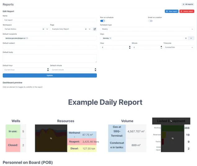
Section titled “2.5.1 Creating and scheduling reports”The example below shows a report scheduled to run on Monday’s at 08:00. It is based on a dashboard and some of the content is marked as hidden so that it will not be included in the issued report.
2.5.2 Viewing issued reports
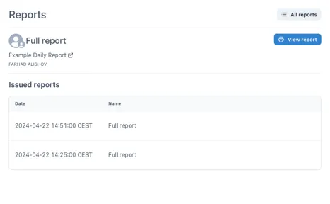
Section titled “2.5.2 Viewing issued reports”When a report is issued the data is snapshotted into the report and is no longer live. This means that the report will always show the data at the time it was issued and cannot be changed (without leaving an audit trail). The history of issued reports is easily accessible.
2.6 Scripts
Section titled “2.6 Scripts”Scripts are essential for automating workflows and making more advanced functionality. The Scripts module in Ingenuity is NodeRed; a flow-based, low-code development tool for visual programming .
NodeRed is the next evolution of Excel for engineers.
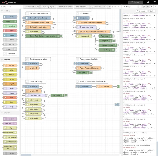
Scripts can be created to do all kinds of tasks from importing data, checking data, combining data, performing actions and exposing new APIs.
NodeRed is a Node.js based application and the functions are written in JavaScript, which is very easy to learn.
Examples of workflows that can be created quickly are:
-
Check if data has changed and run some logic
-
Run every 5 minutes to calculate the amount of fluid that has been removed from a tank
-
Read data from one system, cleanse and process it and write an output to another system
2.7 Knowledge Graph
Section titled “2.7 Knowledge Graph”Hosted in Neo4j, the Knowledge Graph is a digital map of information and how it is related (sometimes called Contextualisation).
It is a semantic graph and can be used to model anything, for example facilities, regions, systems, equipment, roles, maintenance, manufacturers, suppliers, spares catalogues etc.
Semantic means that it addes meaning to information.
It can include non-physical objects like systems, areas, barrier hierarchy, maintenance plans, FEMA failure modes.
It can hold links to information in other systems such as sensor data, documents, drawings, certificates, procedures and there is the possibility to include dynamic information such as work orders.
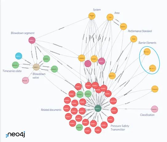
An example of part of a Knowledge Graph showing the information related to a Pressure Safety Transmitter
The Knowledge Graph can also hold data structures that can be used to create model-driven visualisation.
The Knowledge Graph entry in the left-hand panel will give access to the Neo4j browser where the Knowledge Graph can be queried directly using Cypher.
Information on using Cypher is available at https://neo4j.com/docs/cypher-manual/current/introduction/
Information in the Knowledge Graph is used in the Search results (section 1.12) Common Menu (1.12.1) , Asset Model (2.8) and Asset dashboard component (2.2.2).
2.8 Asset Model
Section titled “2.8 Asset Model”The Asset Model tool is a simple browser for the Knowledge Graph that lets the user navigate as if it was a hierarchy.
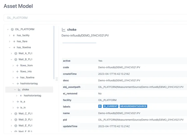
The properties for the object selected are shown in the right hand panel.
Where linked information is connected, such as Timeseries data, it is shown at the top of the right-hand panel.
2.9 Alerts
Section titled “2.9 Alerts”Users can configure checks against changes in information and receive an email or text message when the check is triggered (i.e. when it returns a True status).
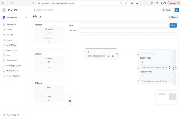
The Alerts configuration is very similar to the Calculations UI and is accessed from the Alerts entry in the left-hand panel.
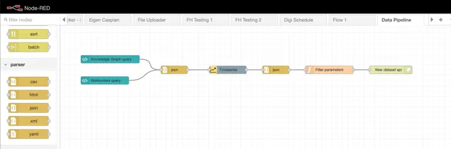
2.10 Data Pipelines
Section titled “2.10 Data Pipelines”Data pipelines are used where either;
-
Further processing is required on an existing datasource before it can be used; or
-
Data from more than one source needs to be combined to create a new dataset
2.11 Documents Portal
Section titled “2.11 Documents Portal”The Documents Portal makes it easy to consolidate all the different kinds of documents and reports that generated internally or received from 3rd parties. It automatically detects metadata such as report type and equipment and saves this in a database.
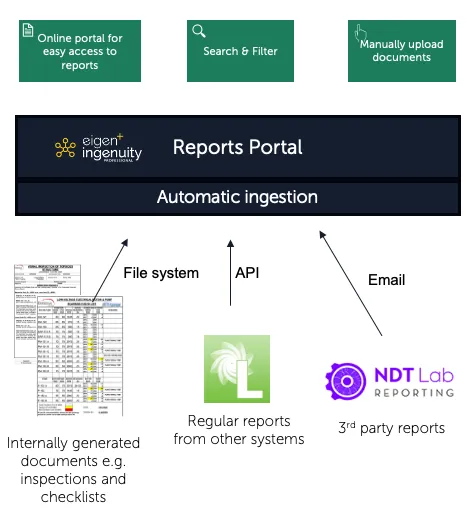
Users can easily search for reports by equipment type, date, company, area, system, location etc. All documents have a URL so can be linked to the associated work-order or scheduled inspection
2.12 Apps
Section titled “2.12 Apps”Ingenuity 7 has a new extensible architecture that supports plug-ins.
A plug-in application makes it easy to extend the functionality of Ingenuity while keeping the same authentication, look and feel and access to data sources.
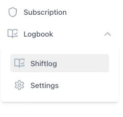
Eigen offer a continually expanding library of plug-in apps, and 3rd parties can also develop apps. For example, the Logbook plug-in can be used to create log books, for example for Shiftlogs, Valve registers, actions etc.
2.13 Wiki
Section titled “2.13 Wiki”The Wiki module makes it easy to create online documentation. It has a simplified page layout that makes it easy to create clean looking documentation.
2.14 Subscription
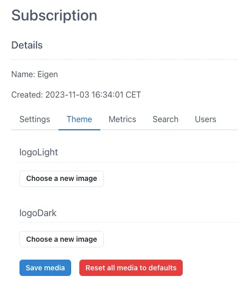
Section titled “2.14 Subscription”The Subscriptions module is only visible to Admins and is used for setting the defaults within the subscription, for example Timezone. It is also possible to change the logo and download usage metrics.
For more information please contact us at info@eigen.co or book a demo on our website at www.eigen.co
3 Administration
Section titled “3 Administration”3.1 Managing Users
Section titled “3.1 Managing Users”3.2 Ingenuity Hub
Section titled “3.2 Ingenuity Hub”Admin users have access to
System Administrators have access to the Ingenuity Hub where news and events can be published to appear in one of the four panels in the Ingenuity Landing page.
[Quicklinks]{.mark}